If We Dissolve Now / We Are More Than We Ever Were

25.11.2023 to 10.02.2024
Galería Elba Benítez, Madrid

“De-differentiation” and “de-architecturization”: these are terms used by Robert Smithson in his work Hotel Palenque to refer to the way that built structures and organic growth, decay and renovation, ruins past and future, all merge ineluctably into an a-centric, entropic object-site-process on the site of a decrepit hotel in the encroaching jungles of the Yucatán peninsula. Moreover, Hotel Palenque, in its own shifting form — initially a live and witty lecture-cum-slideshow that the artist presented to a group of architecture students, a low-quality recording of which was later retrieved and reassembled after his death so as to be exhibited in museum settings around the world as an ersatz art work — echoes its subject matter: Hotel Palenque, like the Hotel Palenque, is a ruin in reverse, something does not fall but rather rises into ruin.
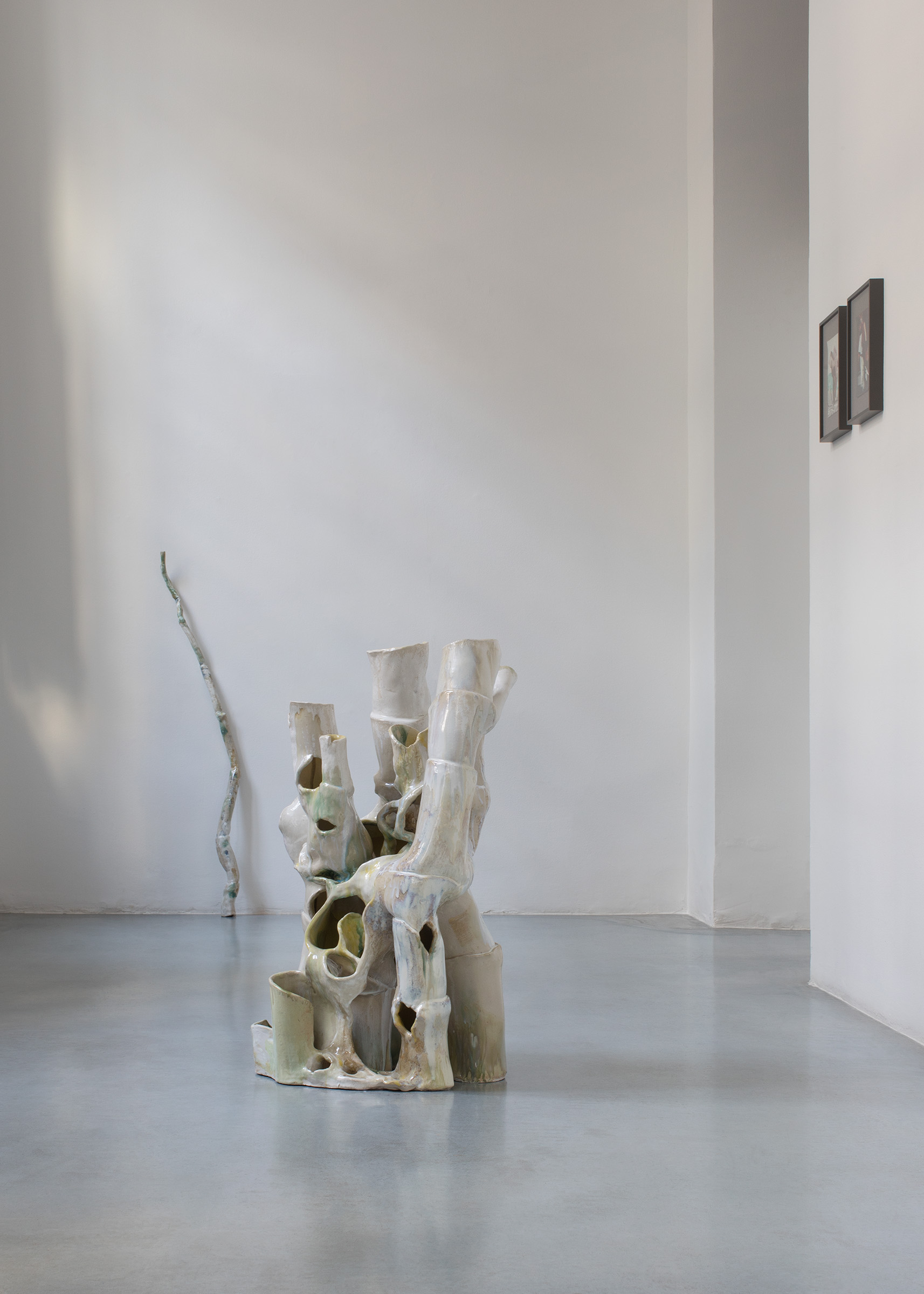
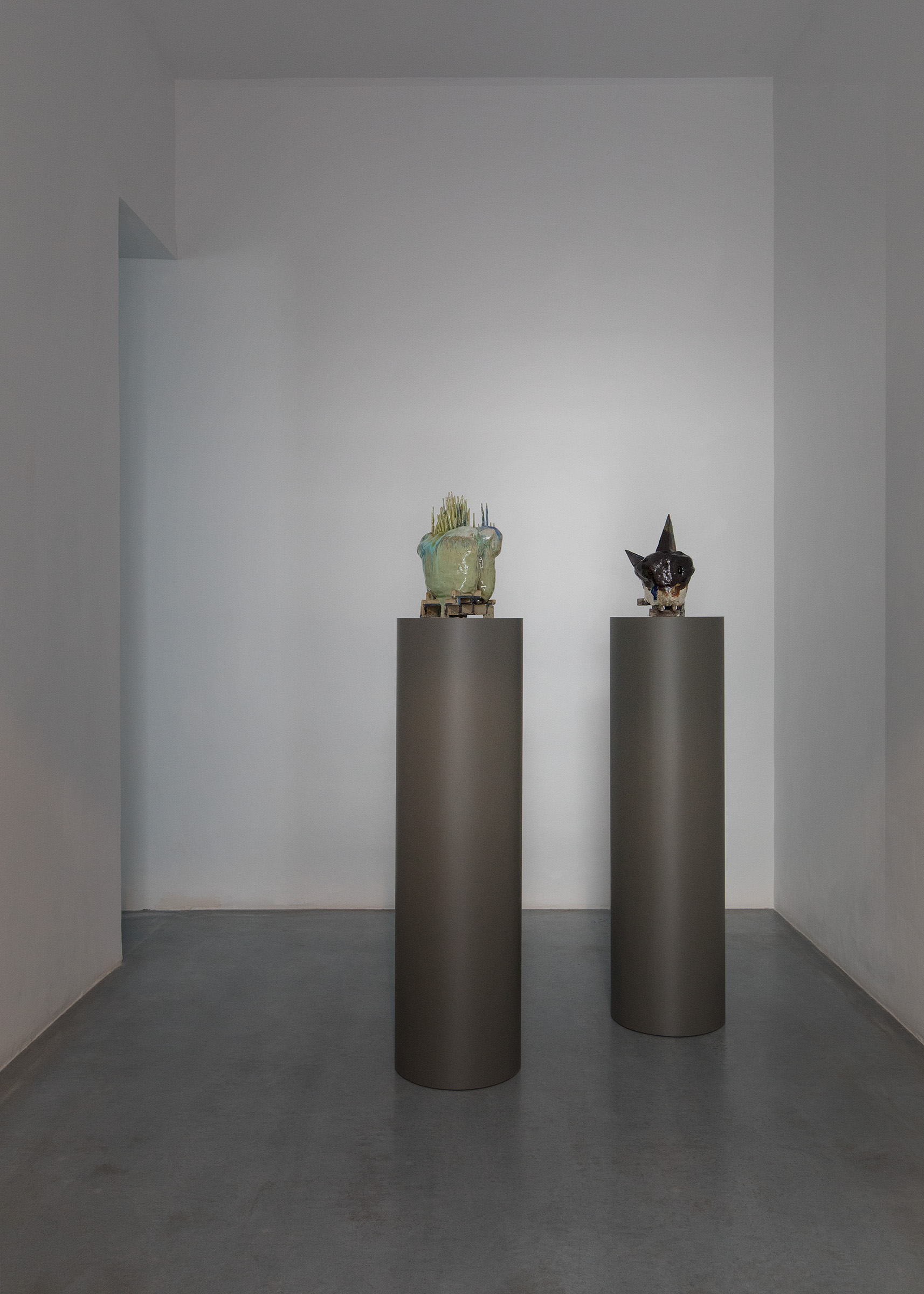
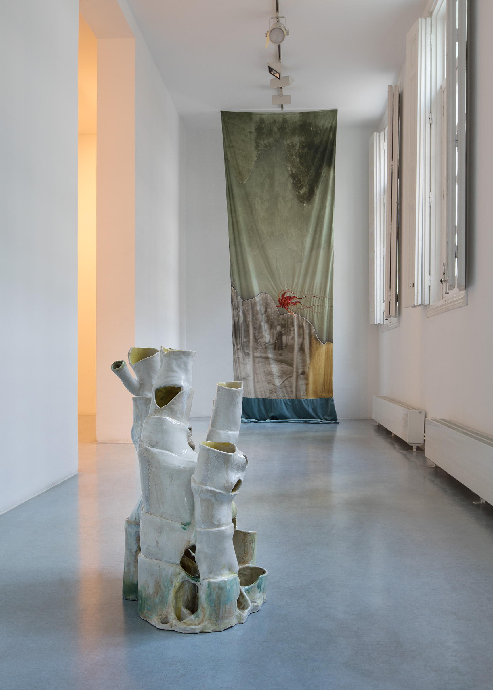
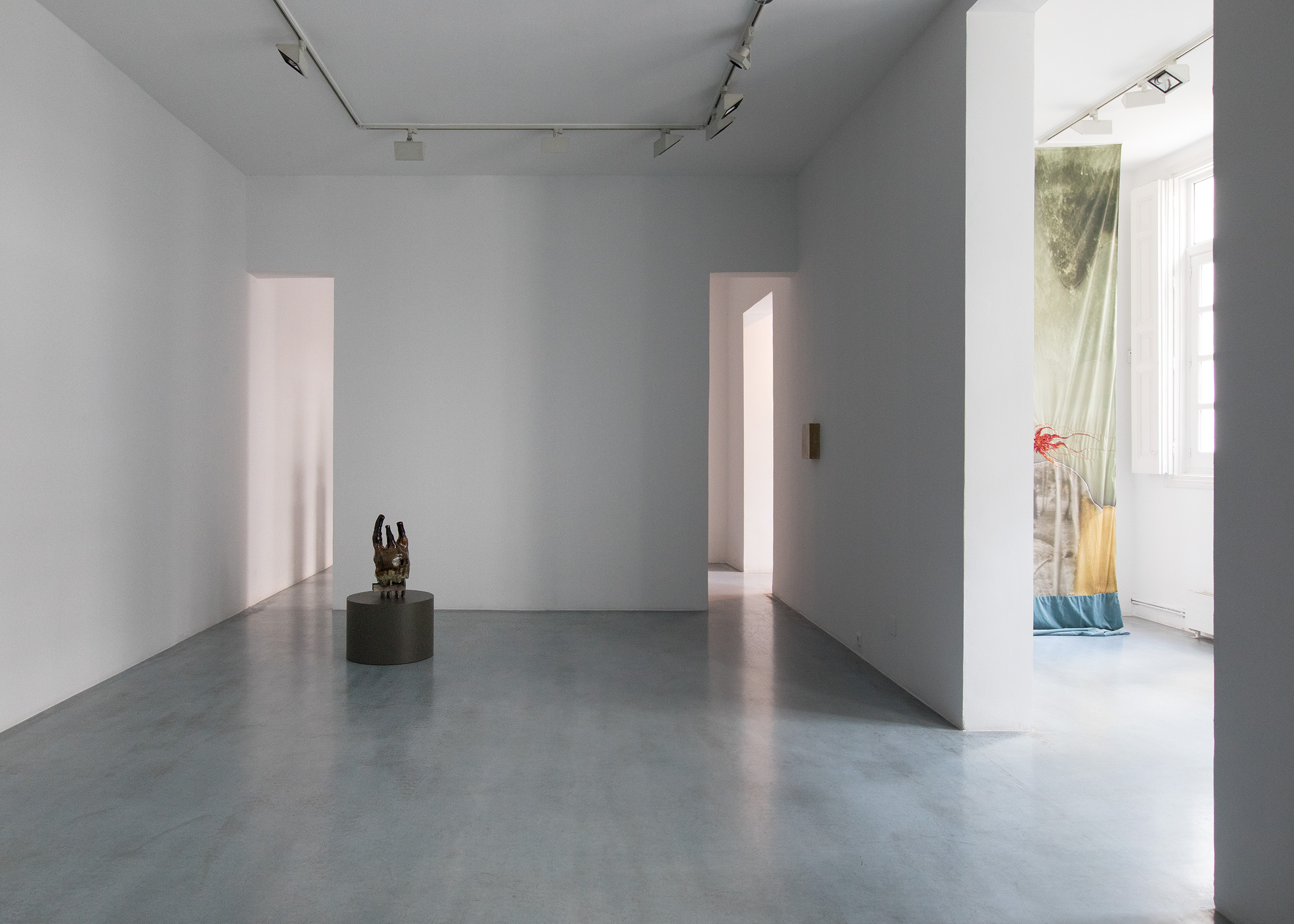
“De-architecturalization” and “de-differentiation” are also apt terms to consider in the context of Isa Melsheimer’s current exhibition at the Galería Benítez. Titled If we dissolve now / We are more than we ever were, the exhibition presents new works in various formats — ceramics, textiles and photographs — throughout which the intertwining of the inorganic with the organic and of stasis with flux functions both as motif and as  concept. A number of the ceramics on view consist of rectilinear structures over and through which amorphous shapes seem to melt and surge and ooze — a kind of ‘de-architecturalization in which the apparently ‘natural’ world overtakes the built environment, as in an encroaching jungle or a bog’s rising water table — whereas in others the sequence seems to be reversed, where there is the suggestion that natural forms are propulsively acquiring engineered-like structural characteristics. The process conveyed by these works seems more reciprocal than juxtapositional. In a similar bidirectional fashion, Melsheimer’s gouaches depict movement via their content — not infrequently human figures in flight — while simultaneously embodying movement in their dynamic, fluid brushwork. And the textile-photographic works, with their literal conjoining of manual production and mechanical reproduction, maintain this sense of intertwined organic-inorganic synthesis.
To “de-differentiate” means to return something that was differentiated (at least to our experience) to an undifferentiated state: in a word, to dissolve. In this sense it functions as the operative principle throughout the works on view in the exhibition If we dissolve now / We are more than we ever were, where it is reinforced by the persistent references to nature, natural processes and, ultimately, to the earth (and what medium is more closely linked to the earth itself than ceramics, as Melsheimer’s ceramic work so exquisitely shows?). But nothing can dissolve into nothing. In terms of earth and earthly matters, the biosphere is a closed system. Anything that dissolves re-solves into something else. Ruins rise, ruins fall. As does everything, always.
Text: Georg Stolz
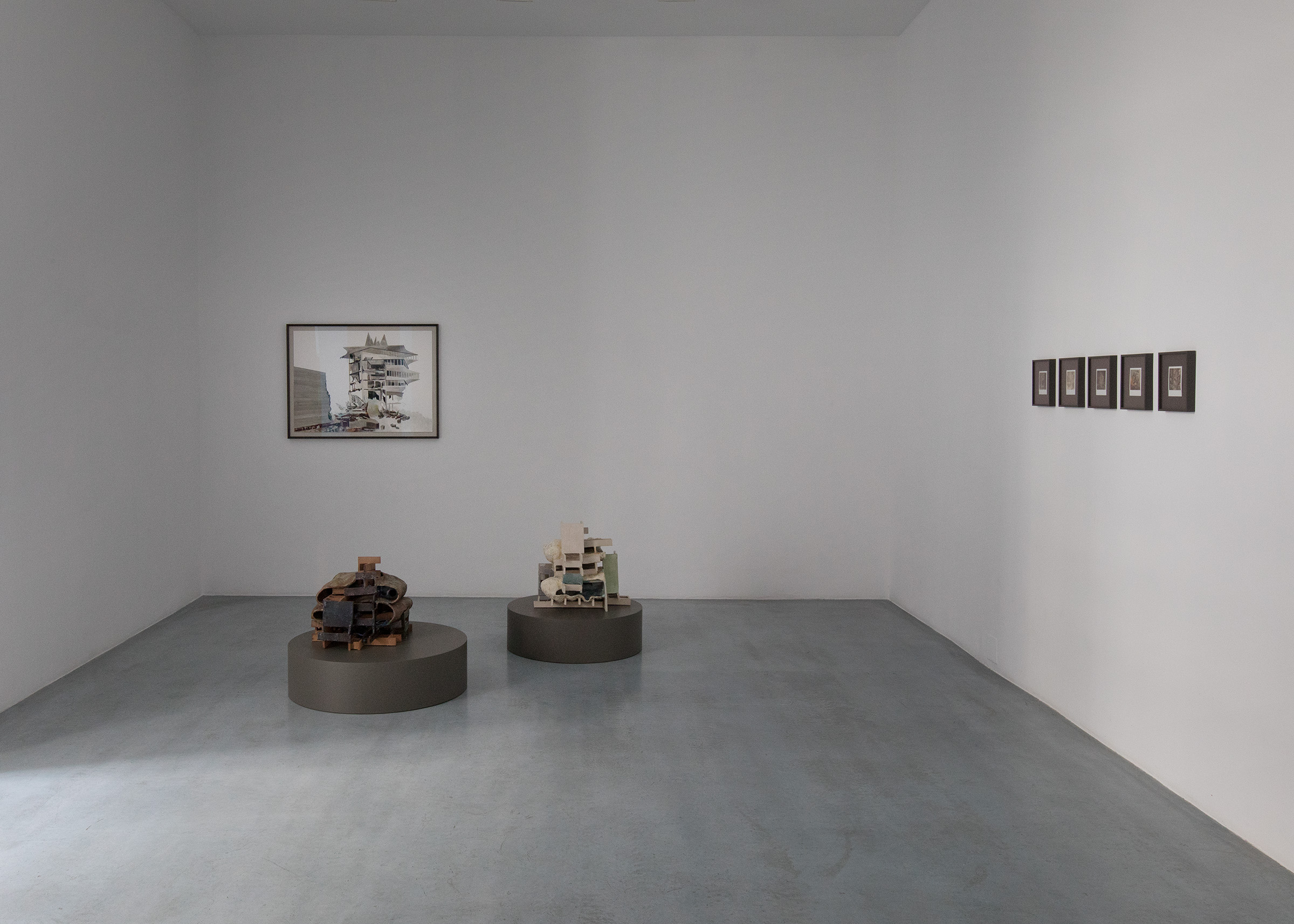
If We Dissolve Now / We Are More Than We Ever Were I, 

polaroid
10,7 x 8,9cm

If We Dissolve Now / We Are More Than We Ever Were IV, 

polaroid
10,7 x 8,9cm

If We Dissolve Now / We Are More Than We Ever Were V, 

polaroid
10,7 x 8,9cm

Inhabitant, 

mirror, metal, tin, padded cockatiel
29 × 20 × 25 cm

Insecta VII, 

fabric, cushion batting, thread
24 x 26 x 17 cm

Isa Melsheimer

11.05.2003 to 29.06.2003
Kunstverein Arnsberg

Isa Melsheimer

26.01.2010 to 18.04.2010
Carré d’art, Nimes

Isa Melsheimer

25.01.2002 to 20.04.2002
Galerie Thomas Rehbein, Köln

Isa Melsheimer

18.02.2005 to 28.02.2005
The Chinati Foundation, Marfa Texas

Isa Melsheimer

19.05.2005 to 25.06.2005
Galerie Jocelyn Wolff, Paris

Isa Melsheimer

05.09.2008 to 19.10.2008
Städtische Galerie Nordhorn

 
1.9.2008 AND 8.11.2008
(Isa Melsheimer in conversation with Katrin Wittneven from Novem-ber 2008, as well as an extract from Wittneven’s presentation on Melsheimer’s work from September 2008)
Architecture is a central theme in your work. What are the implications with regards to planning and how do you approach exhibition spaces?
There are familiar spaces, such as gallery spaces and others, which you only know from photos. Usually, I go there first, walk around, look at maps and take in the surroundings: where is it? What kind of place is it? What is its history and how am I connected with it ? I had already exhibited at the Municipal Galerie Nordhorn in a group show three or four years ago. It was back then that this particular space, a piece of work by Steven Craig referring to Mies van der Rohe, interested me.
What did you remember?
A space within a space. I believe that Stephen Craig’s intervention had originally been much finer, purer somehow. Over the years, more and more new fixtures, offices and flooring were added so that, today, you hardly experience the space as a piece of work. I was interested in making the work visible again, extracting the ‘borrowings’ from Mies van der Rohe, explicitly the Barcelona Pavilion, and developing them further.
In Nordhorn, Isa Melsheimer came across a pavilion that had been designed as sculptural architecture by the Irish artist Stephen Craig in 1999. A versatile all-purpose space that not only in its multi-functionality, recalls the work of Ludwig Mies van der Rohe. A contemporary response to Mies’s credo “less is more”.
Looking at the basic architectural elements − pillar, wall, roof − the steel-glass-construction of Berlin’s New National Gallery (completed in 1968), as well as Mies van der Rohe’s first architectural milestone: the Barcelona Pavilion of 1929, cross one’s mind. It was with this temporary building that Mies, for the first time, began to achieve the great sense of clarity and simplicity that he strove for. The Pavilion only existed for a few months and was not re-constructed until the eighties. The crucial innovations were the “open plan” and the “flowing space”. The reinforced concrete roof of the Barcelona Pavilion rests on filigree stanchions with wall-elements and panes of glass stretching from floor to ceiling. Flooring, roof and wall-surface do not enclose the space but rather suggest peripheries. The result is a clear structure which also allows for various spatial combinations. Mies himself was well aware of the revolutionary power of this innovation: “One night, I was working late (on the Pavilion) when I made a sketch of a freestanding wall and was absolutely shocked. I knew that I had found a new principle”.
Isa Melsheimer absorbs Craig’s directions and by transforming elements of the Barcelona Pavilion into the exhibition space and translating them into her own artistic vocabulary, develops them even further. She creates a very minimalist interior: a curtain, a carpet and a pillar from chrome-plated stainless steel. The crosswise pillar − also a direct Mies quote − is rather reduced. Less is impossible, is it still meant to bear weight. It extends the raster of the exhibition’s architecture and, at the same time, in its isolation and with its minimalist reflecting surface, gains a sculptural quality. In contrast to the Barcelona Pavil-ion with its black carpet and red curtain fabric, the artist restricts herself to stone-like shades of green, brown and grey.
You take Craig’s space back to its original condition, dispense with partition walls and fixtures and, instead, combine more diverse materials: stone, glass, fabric, onyx.
I am fascinated by the story of a block of onyx which Mies came across by chance, being the starting point of a building as legendary as the Barcelona Pavilion. The dimensions of this stone were the starting point and the fixed point in the planning of the Pavilion. I’d had boards of travertine, which I had accidentally come across, sitting in my studio for some time. They seemed to be perfect for Nordhorn.
In Isa Melsheimer’s replica of the Barcelona Pavilion, the original atrium becomes a landscape of broken glass. A lucid construct, consisting of countless splinters of glass which, in its glittering, fragile beauty, appears to be vulnerable and thereby dangerous, at the same time. The plates of broken glass, shimmering in green shades, trigger associations with Caspar David Friedrich’s “Sea of Ice”, as well as with models of futuristic mega-cities. You think of a wave, frozen in its movement, but also of abstract translations of landscapes, seen on weather charts after the news. In the exhibition, they mark an area of 660cm by 100cm and thus, have exactly the dimension of the atrium of the Barcelona Pavilion. Its panes were made from white glass and so allowed the image of a secret garden to flourish.
Did you have a clear picture of the exhibition in mind, beforehand?
I clarify a lot of things with the help of a model and I usually have quite a clear idea before I start. In Nordhorn, a few things were -already predetermined, as my arrangement was based on the Barcelona Pavilion. The 120 onyx-vases were arranged on the surface of the original onyx-wall and the dimensions of the glasswork were geared to the dimensions of the atrium of the Barcelona Pavilion. 
Onyx is quite a classical material. At the same time, you caricature the traditional stone by using onyx-vases, known from tourist-traps.
This also has to be read as an ironic comment, of course. In the exhibition, you can hear extracts from an interview with Mies from 1968 over headphones. In this conversation, he explains, how, originally, the shipping company was to receive the block of onyx, in order to make large vases for the dining-hall out of it. Mies chipped off a thin slice to show how beautiful the stone was and thus, even-tually got it for the Pavilion. My work plays with the ugliness of such vases, which look rather like urns. Yet, strangely, they look quite acceptable en masse.
It was one of Mies van der Rohe’s principles to use materials as they approach you, in a way, listen to them and recognize the structural qualities of steel and stone, and in this way, to embrace them and subject them to the desired shape.
There is not much left of this liberation, of the innovations brought about by architectural modernity. Most things that are constructed today are, again, closer to the onyx-vase than to the onyx-wall. Embroidery on pillows shows examples of buildings that mainly place emphasis on their decorated facades. One example is a red brick building at Potsdamer Platz which is only a few years old and appears to be very solid but has already started to lose bricks. Only then did it become clear to me that they are not actually bricks but clinker. Strictly speaking, this means two steps back: Modernity introduced the open plan. Today, we are back at small windows in brick-walls. And they are not even real. That is simply decoration, kitsch, a tourist-trap − just like the onyx-vases.
Mies van der Rohe wanted the big hall inside the New National Gallery to be used as a stage. Isa Melsheimer’s installations and sculptures, too, repeatedly evoke associations with stages. In both, art becomes the protagonist; as does the viewer who walks around in it, picks up the thread and follows.
Is there ever a moment when you consider a space to be completed?
Yes, I think so. Often, it is very full to start with and then becomes increasingly empty. I work on details in a very precise way but I eventually get to a point where I say, okay, let’s leave it as it is. There is no such thing as the perfect space. I believe there is always more than just one possibility. Is that what you mean?
I meant it in an even more concrete way: Mies also had a theoretical background for his way of working. He once said: “I felt that it had to be possible to harmonize old and new powers within our civilization. Each of my buildings was a demonstration of this thought and a further step in the process of my own search for clarity”.
In my eyes, art can only clarify what is there already. Not only in the sense of harmony or beauty, but in the true sense of clarity. That is a good word for it.
 

Isa Melsheimer, 

Mönchehaus Museum, Goslar

catalogue, text by Bettina Ruhrberg, 62 pages, 41 colored illustrations, softbound, ed. Mönchehaus Museum, Goslar 2007

Isa Melsheimer, 

Wiens Verlag

catalogue, text by Stefan Ripplinger, biography and list of publications, 124 pages, ca. 80 colored illustrations, clothbound, Wiens Verlag, Berlin 2005

Isa Melsheimer, Kunstpreis der Stadt Nordhorn , 

Städtische Galerie Nordhorn

Kunstpreis der Stadt Nordhorn 2008, catalogue (germ./ engl.). text by Roland Nachtigäller, interview with Isa Melsheimer by Katrin Wittneven, 32 pages, b/w and coloulred illustrations, stapled, Nordhorn 2009


Isler, 

concrete, metal, gouache on paper
10 × 34 × 22 cm, 8 × 46 × 46 cm, 14 × 71 × 42 cm, 42 × 46 cm