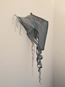
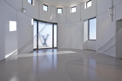
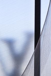
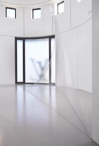
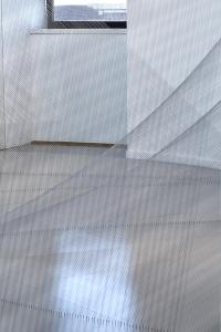
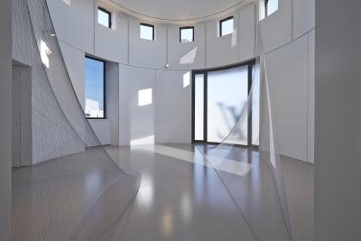
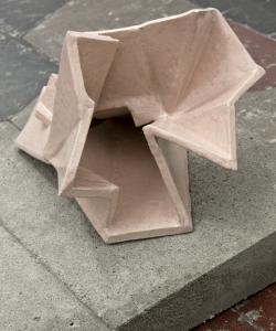
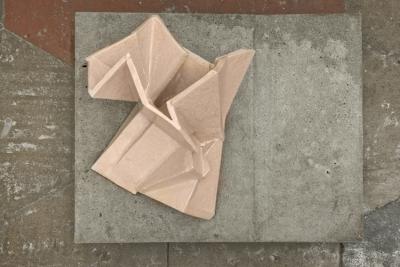
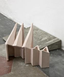
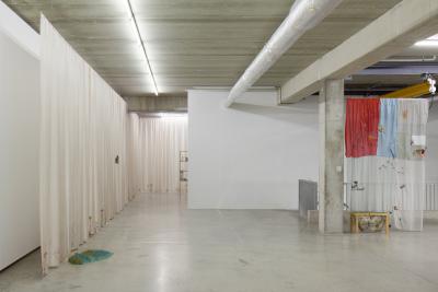
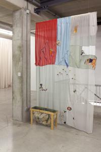
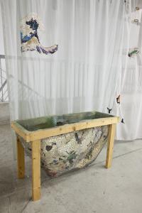
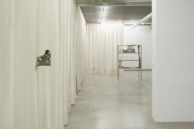
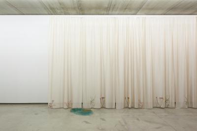
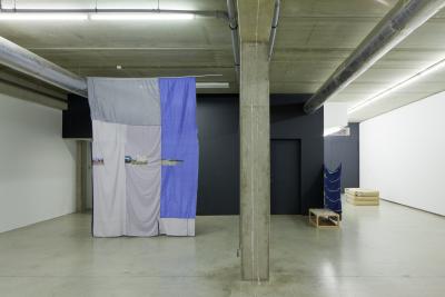
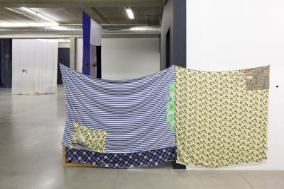
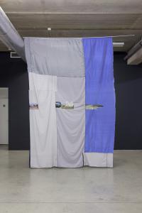
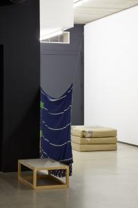
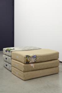
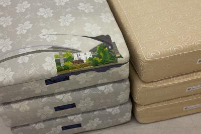
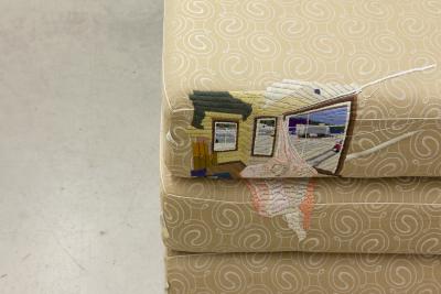
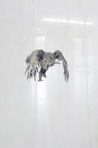
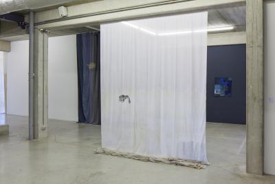
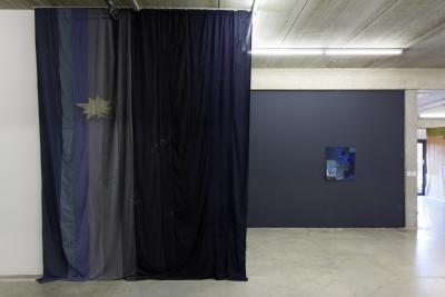
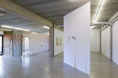
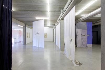
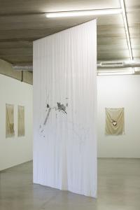
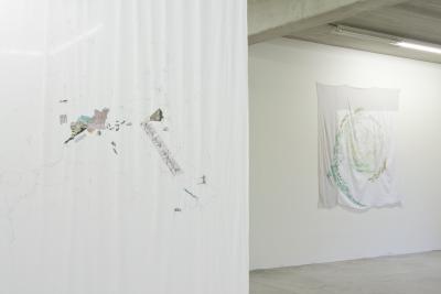
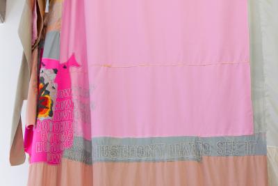
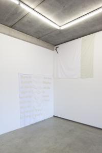
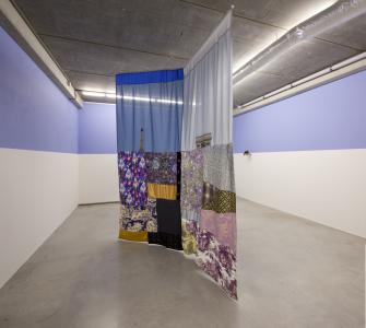
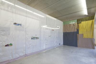
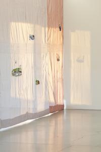
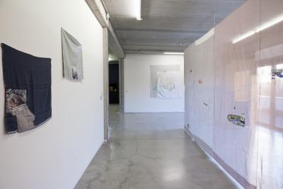
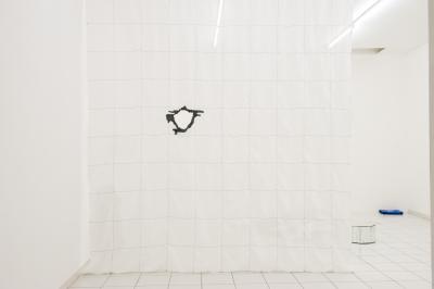
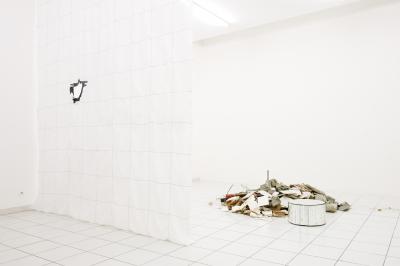
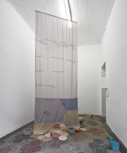
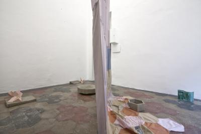
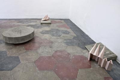
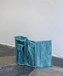
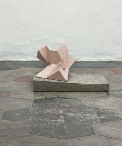
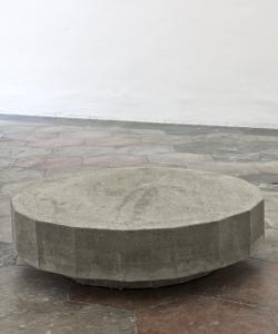
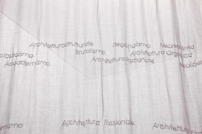
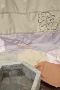
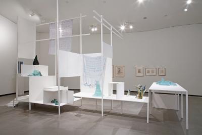
A filigree crystal beneath a shimmering aureola – the Berlin-based artist Isa Melsheimer (*1968) has given her exhibition Need for Contrast, at the Enrst Barlach Haus in Hamburg, a remarkably delicate, poetic opening. The thread-work Circle / Star, which enters the space like a column of light from a round opening in the ceiling, and the sculpture Luckhardt 3, an assemblage of small glass plates, create an atmosphere of weightlessness. In its spaceship-like outline, Luckhardt 3 goes back to a theatre designed by the architect Wassili Luckhardt in 1921; Isa Melsheimer created the object in 2009 as a response to the architectural utopias of the artistic correspondence known as the Crystal Chain. Now this sparkling starship announces a journey into the future. Ready for take-off. Isa Melsheimer explores urban living spaces and the prerequisites for their design and change. She is equally interested in the formal vocabulary of modern architecture, urban-planning scenarios and the dynamics of social tension. Often responding to the specific sites of her exhibitions, Melsheimer creates complex spatial installations with surprising leaps in scale, changes of perspective and material contrasts – Post-modern Ruin applies her strategy of pointed polarisation in a combination of fine porcelain parakeets and a crude concrete pedestal. Along with sculptures in glass, concrete or ceramic, her model-like setups also include embroidered curtains or networks of thread, arrangements of collected objects or ensembles of living plants. The sculptural work is accompanied by gouaches in which quotations from art, architecture, design and pop culture overlap and interfuse. The imaginative variety and wide intellectual range that Isa Melsheimer can open up in real spaces is shown in her exhibition Need for Contrast, whose title quotes the architect of the Ernst Barlach Haus, Werner Kallmorgen (1902–1979). In his “need for contrast”, Kallmorgen saw a basis for the design, observation and experience of buildings, and Melsheimer, who has borrowed the term for her exhibition, feels it to be a basic motivation of her artistic work. Her installations set up collision courses which lightly disturb and energise things, shifting and readjusting our point of view – and suddenly illuminating the fact that even firmly established circumstances are ultimately created by ourselves and can thus be altered. Isa Melsheimer takes Kallmorgen’s plea for contrast as the starting point for artistic excursions into the architectural and urban culture of Hamburg. Apart from the Ernst Barlach Haus, which opened in 1962, she wittily trains her sights on more of Kallmorgen’s striking buildings, sounding out their functional architecture and sometimes dysfunctional history. Melsheimer’s exhibition tour covers two spaces: the atrium and the large exhibition hall on its north side. While the latter space, with its skylight niches and stone landings, is an originally preserved creation of Werner Kallmorgen, the atrium was fundamentally altered in 1995/96: the formerly open-air courtyard substantially forfeited its original character through the addition of a glass roof and a light stone floor. In the juxtaposition of her two exhibition spaces (between which a facade of windows enables visual relationships and interplay) Melsheimer addresses the issue of different temporal horizons: buildings are redesigned and turn out, in their transformation, to be indicators of changes in human needs and social values. In Hamburg eloquent proof of such changes is provided by some of Werner Kallmorgen’s buildings, which Isa Melsheimer arranges in the atrium in the form of concrete models: his Kaispeicher A, built between 1963 and 1966, and the ensemble of the Spiegel and IBM Towers, constructed from 1966 to 1969. Melsheimer followed the history of these buildings with great interest, and has them appear several times in a sequence of 27 small-format photographic prints. While the imposing Kaispeicher A has been transformed into the pedestal for a new prestigious landmark, and now – gutted and refilled – serves as the foundation for Herzog & de Meuron’s Elbphilharmonie, the Spiegel ensemble, after the news magazine moved to the HafenCity and following several years of ruinous vacancy is currently being converted into the apartment hotel Hamburg Heights (“Arrive at the top!”) for solvent business people a remarkable change in function for the former headquarters of critical leftwing journalism. Kallmorgen’s post-war classics as current points of political crystalisation and urban friction, as objects of social transformation: Isa Melsheimer has a marked talent for searching out controversial phenomena and illuminating connections, and then weaving them into a tightly linked artistic network. Here she begins in the courtyard of the Ernst Barlach Haus, which thanks to its glass roof frequently provides an opportunity to experience the Hamburg summer in an unfamiliarly Caribbean mode. Melsheimer uses this potential to style the atrium as an exotic tropical greenhouse in which Kallmorgen’s large buildings face an entropic future. The evocatively luxuriant and alarmingly austere staging of concrete skeletons and remnants of glass, through which the visitor wanders like Gulliver in Lilliput, encapsulates the motto Isa Melsheimer has chosen to supplement her borrowed exhibition title: “Back to the future – elimination of error.” Pile of Snow gives an absurd accent to the surreal atmosphere of this overheated apocalyptic scenario. The object in glazed ceramic that Melsheimer has placed at the heart of the Spiegel ensemble is in no way indebted to an inclination towards artistic distortion, but on the contrary to particular faithfulness to sources: in one of the most famous photographs of the Spiegel compound, which Melsheimer studied closely for her research, a pile of snow becomes a secret protagonist; ist amorphous form asserts itself in the strictly gridded setting, and attenuates the apodictic sharpness of this photographic homage to the right angle. Isa Melsheimer considers Kallmorgen to be a pioneering builder in his precise, functional formal language, and she is impressed by his architectural selfconception. In his reserved, indeed servient attitude to his commissions he almost seems to come from another planet in today’s era of spectacular ego-architecture. Melsheimer’s appreciation of Kallmorgen becomes apparent in the exhibition. For example, she has chosen to use the original furniture he designed for the Ernst Barlach Haus as the basis and diving board for her artistic journeys through time. Along with four showcases she uses a large square table which – as shown by a historical photograph from the opening year of 1962 – enthroned a massive glass ashtray. Melsheimer takes this object as the starting point for imaginary journeys into the past – symbolising as it does an astonishingly permissive (at least in the matter of smoking) society that now, a few decades later, already seems to be eons away. This society is recalled by other images in the photographic sequence: round-table political debates, for example with Helmut Schmidt, can be seen alongside a smoking Audrey Hepburn in “Breakfast at Tiffany’s” not to mention a portrait of the smoker Ernst Barlach Isa Melsheimer has integrated two of Barlach’s early ceramic vessels – “Nöck” and “Merman”, from 1903/04 into the exhibition; they correspond to her own three ashtray variations on Kallmorgen’s table, to which she was inspired by Barlach’s art-nouveau works, but also by the facade of the Spiegel Tower and the undulating roof of the Elbphilharmonie. The clever marketing strategies currently being used to advertise the luxury flats in the Elbphilharmonie are presented in a table showcase Modern Times. Here a glossy magazine is held open by a flesh-coloured object like a fork or dowsing rod. Its anthropomorphic form is taken from the concert hall’s futuristic window panes, which reappear in numerous advertising images. Alongside this insight into a sleek, elegantly hypothermic future world (for which a little army of troublemaking origami animals has struck out), the February 1969 cover of the “Spiegel” magazine points to urban-planning conflicts in its title story, “Spoiling the future. Housing in Germany”. In the same issue the publisher announces ist move into the recently completed Spiegel Tower. On the back page there is an advertisement for the cigarette brand Ernte 23, produced by the Reemtsma company. Its director for many years, Hermann F. Reemtsma, first met Ernst Barlach in 1934, and in 1961 commissioned Werner Kallmorgen to build a museum for the artist’s work in the Jenischpark. A chain of associations comes full circle. The fantastical excursions in which Isa Melsheimer interleaves apparently disparate phenomena as seamlessly as she thread-morphs heterogeneous forms into one another are journeys into the past and future. Accordingly, the Kallmorgen cosmos is consistently linked to the parallel universes of science, both academic and popular, the comic and the science-fiction film. All kinds of time-travel theories and stories, symbols and metaphors from these worlds have been brought into the exhibition. Melsheimer quotes the butterfly effect, for example – which describes the incalculable effects of the most insignificant causes in chaos theory and thus plays a central role in the genre of the time-travel film – first as an embroidered visualisation of a system of differential equations, formulated by the meteorologist Edward N. Lorenz in the early 1960s, on the curtain Lorenz Attractor, and second as an elaborate butterfly-shaped network of threads which concentrates into radiation beams, escapes from the showcase Future Prospect and transforms itself into a star on the wall. On other curtains, which also allude to the museum’s original décor of light drapes around the inner courtyard, Isa Melsheimer names the physical paradoxes associated with time travel, or configures beaded wormholes, whose contractions of space and time could perhaps make time travel possible. The installation naturally also features curious time machines from various films – the Cosmic Key from “Master of the Universe”, the DeLorean DMC-12 sports car from “Back to the Future” and the whirlpool from “Hot Tub”. Together with a comic version of H. G. Wells’s science-fiction classic “The Time Machine” (1895), Isa Melsheimer gives the cheap plastic merchandise a classy showing in Kallmorgen’s tall purist cabinet. Stills from all these films are interspersed in the above-mentioned photographic sequence, which is introduced by five gouaches paraphrasing early Kallmorgen buildings from 1929 to 1931: the Renner Summerhouse in Sierksdorf on the Baltic Sea, the Nordwald House in Hamburg-Osdorf and a residential and commercial building with an illuminated advertising facade of frosted glass. Isa Melsheimer, however, takes the buildings out of their historical contexts and carries them off into mysteriously glowing cosmic spaces. Yet again Need for Contrast enables new connections to be made through looking and thinking. Ready for take-off.
Karsten Müller
