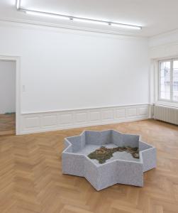
If We Dissolve Now / We Are More Than We Ever Were

25.11.2023 to 10.02.2024
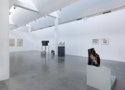
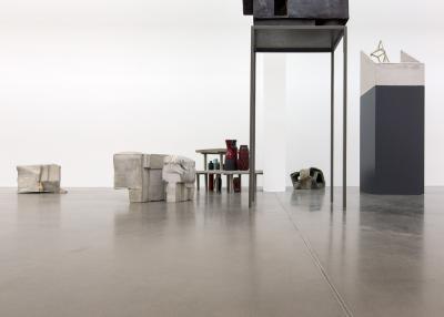
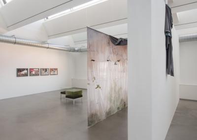
Galería Elba Benítez, Madrid

“De-differentiation” and “de-architecturization”: these are terms used by Robert Smithson in his work Hotel Palenque to refer to the way that built structures and organic growth, decay and renovation, ruins past and future, all merge ineluctably into an a-centric, entropic object-site-process on the site of a decrepit hotel in the encroaching jungles of the Yucatán peninsula. Moreover, Hotel Palenque, in its own shifting form — initially a live and witty lecture-cum-slideshow that the artist presented to a group of architecture students, a low-quality recording of which was later retrieved and reassembled after his death so as to be exhibited in museum settings around the world as an ersatz art work — echoes its subject matter: Hotel Palenque, like the Hotel Palenque, is a ruin in reverse, something does not fall but rather rises into ruin.
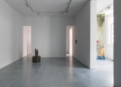
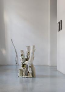
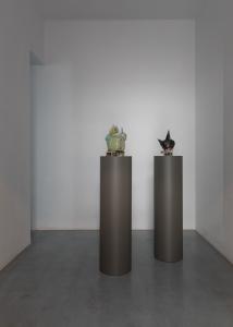
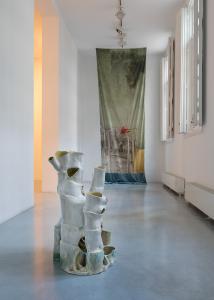
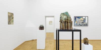
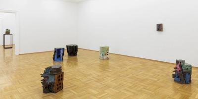
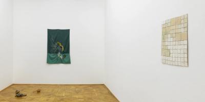
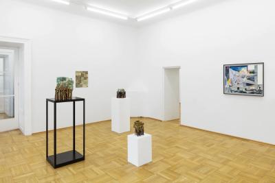
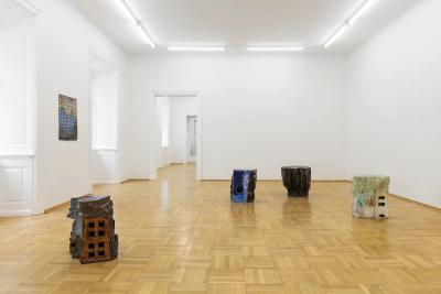
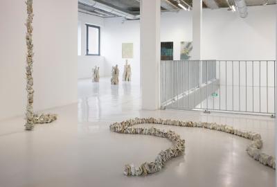
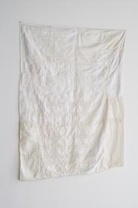
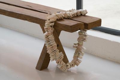
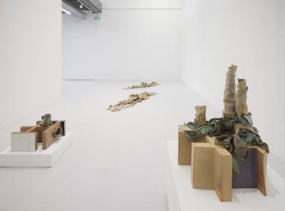
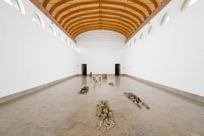
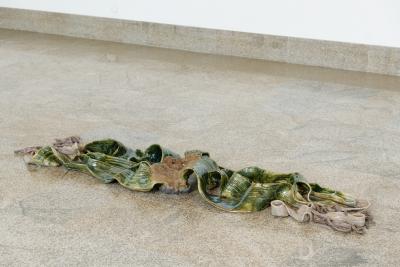
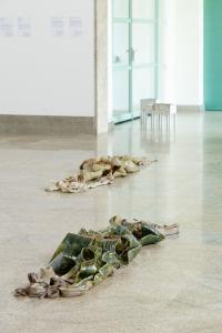
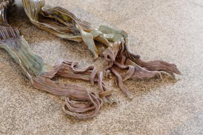
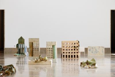
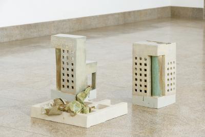
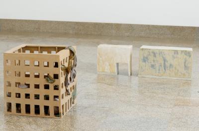
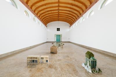
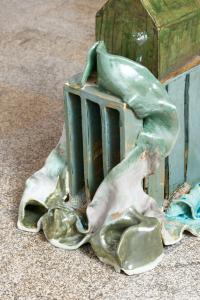
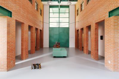
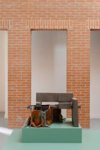
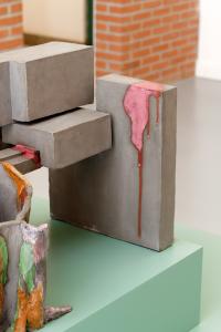
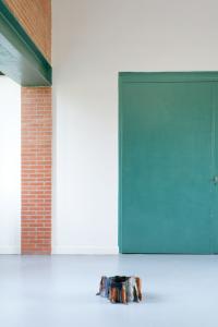
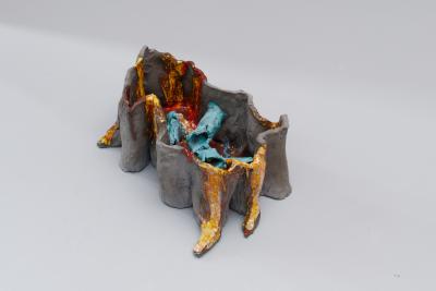
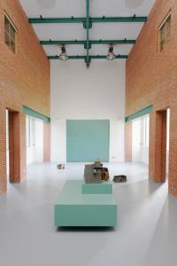
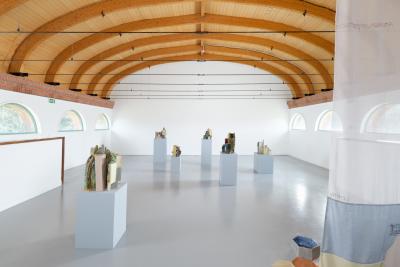
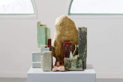
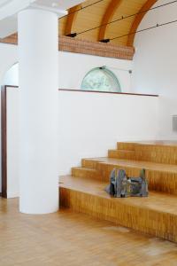
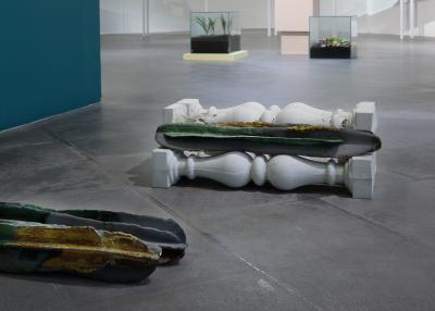
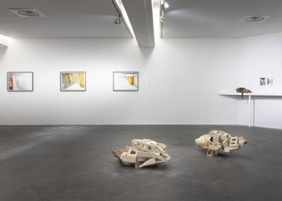
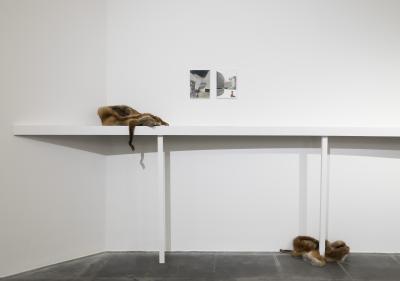
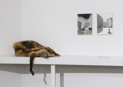
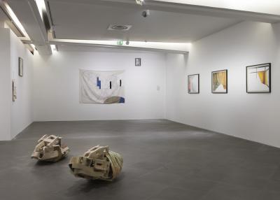
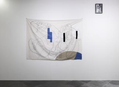
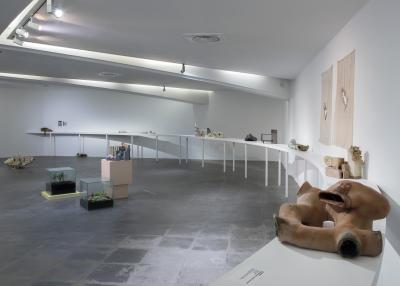
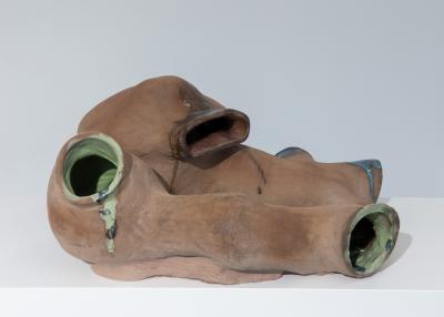
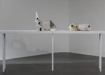
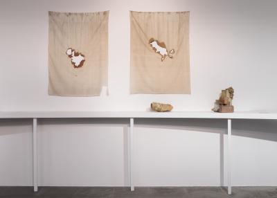
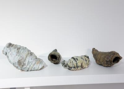
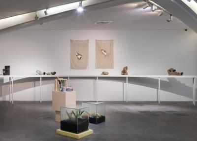
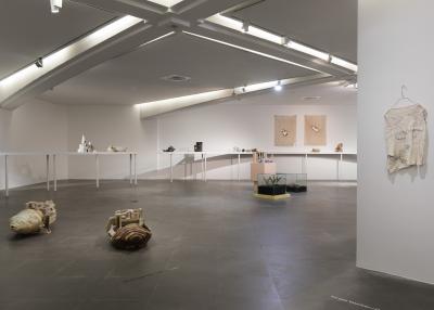
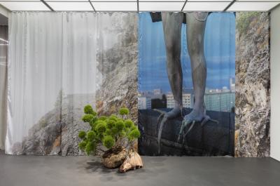
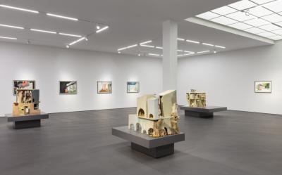
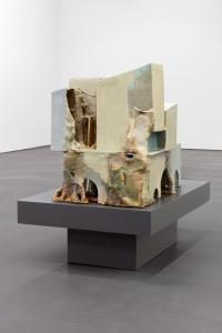
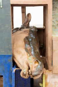
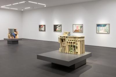
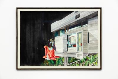
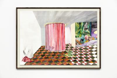
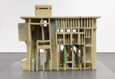
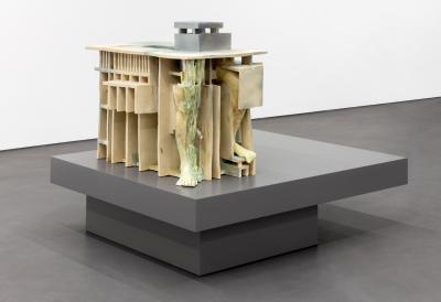
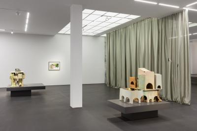
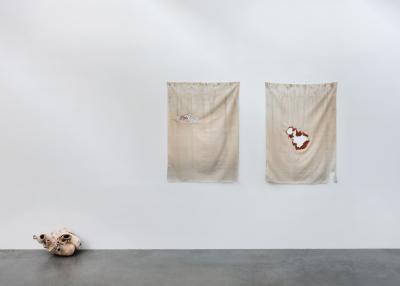
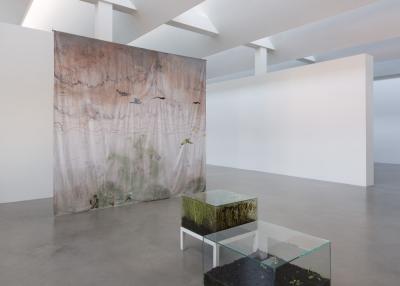
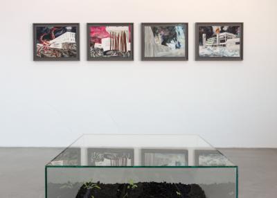
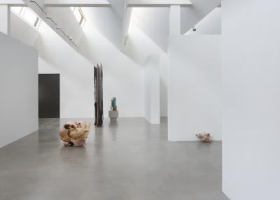
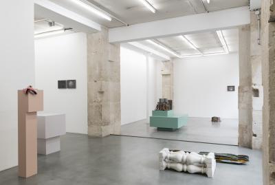
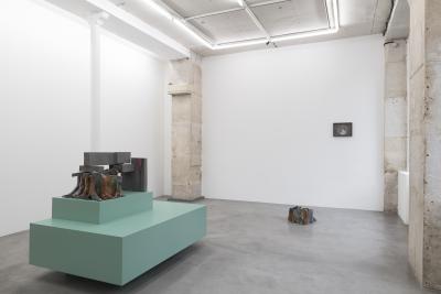
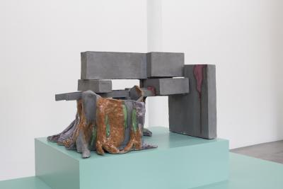
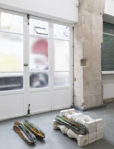
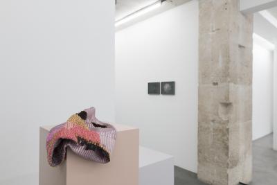
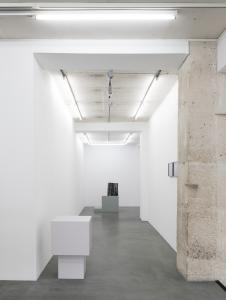
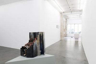
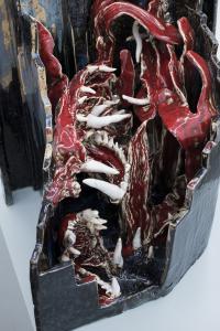
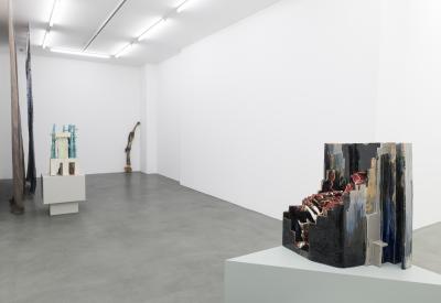
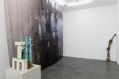
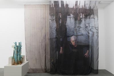
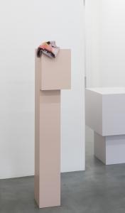
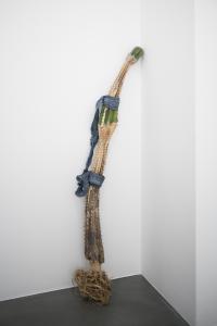
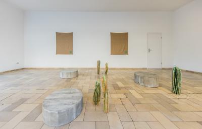
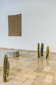
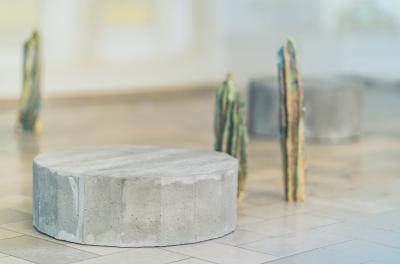
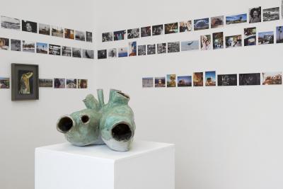
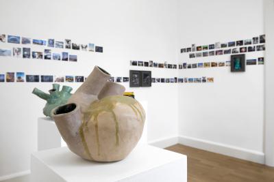
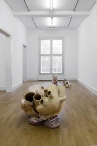
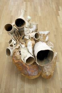
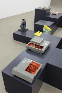
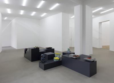
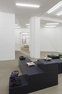
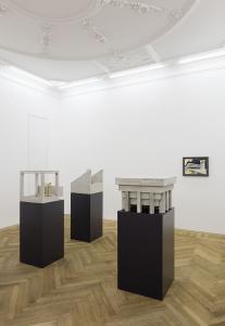
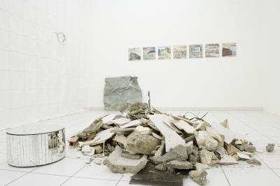
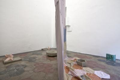
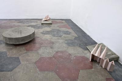
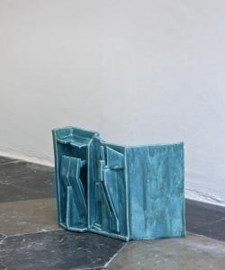
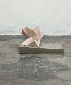
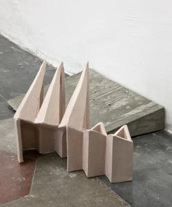
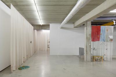
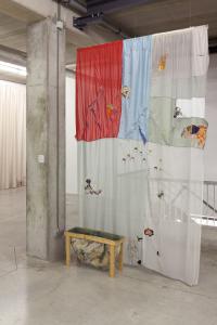
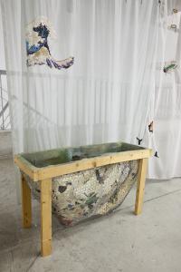
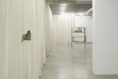
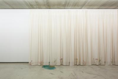
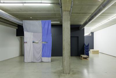
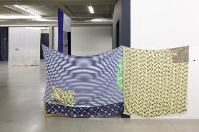
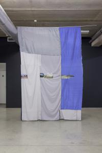
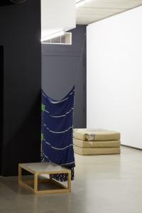
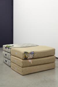
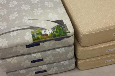
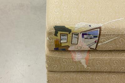
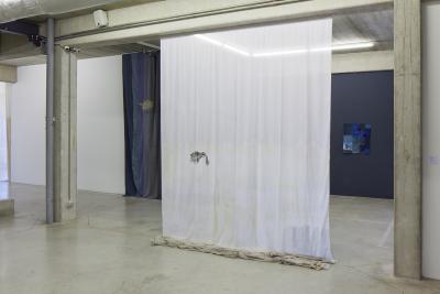
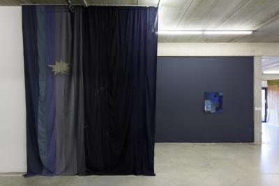
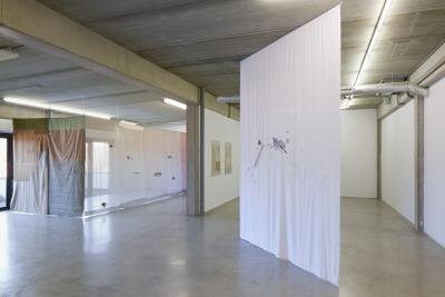
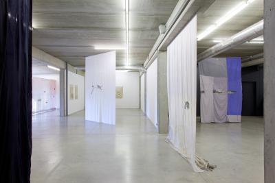
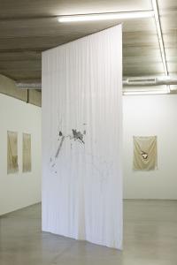
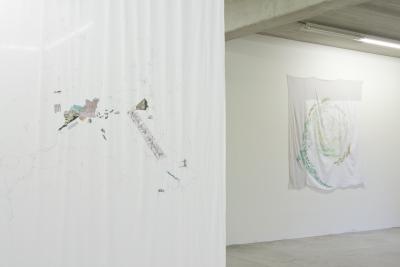
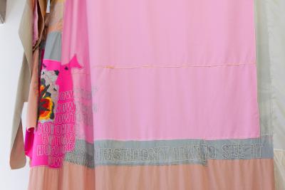
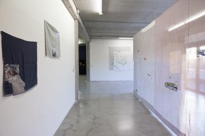
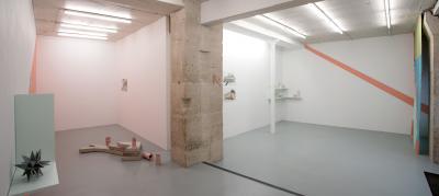
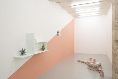
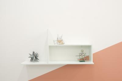
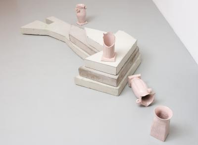
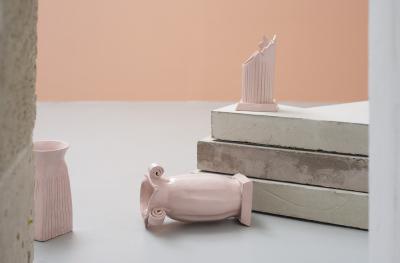
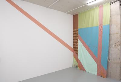
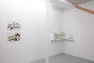
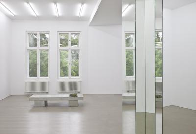
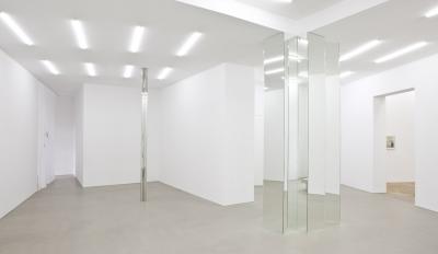
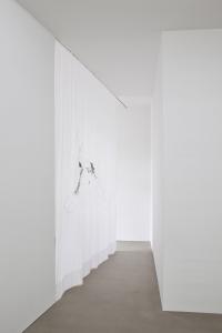
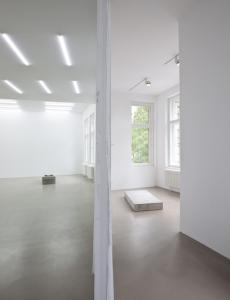
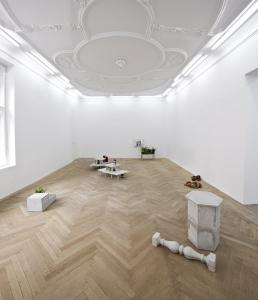
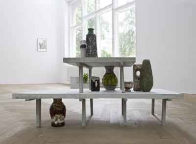
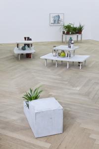
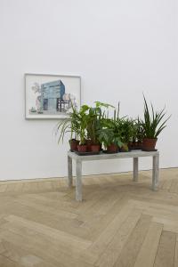
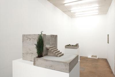
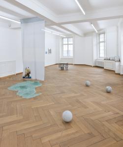
“De-architecturalization” and “de-differentiation” are also apt terms to consider in the context of Isa Melsheimer’s current exhibition at the Galería Benítez. Titled If we dissolve now / We are more than we ever were, the exhibition presents new works in various formats — ceramics, textiles and photographs — throughout which the intertwining of the inorganic with the organic and of stasis with flux functions both as motif and as  concept. A number of the ceramics on view consist of rectilinear structures over and through which amorphous shapes seem to melt and surge and ooze — a kind of ‘de-architecturalization in which the apparently ‘natural’ world overtakes the built environment, as in an encroaching jungle or a bog’s rising water table — whereas in others the sequence seems to be reversed, where there is the suggestion that natural forms are propulsively acquiring engineered-like structural characteristics. The process conveyed by these works seems more reciprocal than juxtapositional. In a similar bidirectional fashion, Melsheimer’s gouaches depict movement via their content — not infrequently human figures in flight — while simultaneously embodying movement in their dynamic, fluid brushwork. And the textile-photographic works, with their literal conjoining of manual production and mechanical reproduction, maintain this sense of intertwined organic-inorganic synthesis.
To “de-differentiate” means to return something that was differentiated (at least to our experience) to an undifferentiated state: in a word, to dissolve. In this sense it functions as the operative principle throughout the works on view in the exhibition If we dissolve now / We are more than we ever were, where it is reinforced by the persistent references to nature, natural processes and, ultimately, to the earth (and what medium is more closely linked to the earth itself than ceramics, as Melsheimer’s ceramic work so exquisitely shows?). But nothing can dissolve into nothing. In terms of earth and earthly matters, the biosphere is a closed system. Anything that dissolves re-solves into something else. Ruins rise, ruins fall. As does everything, always.
Text: Georg Stolz

Continual Process of Improvement

30.03.2023 to 13.05.2023
Galerie nächst St. Stephan Rosemarie Schwarzwälder, Wien

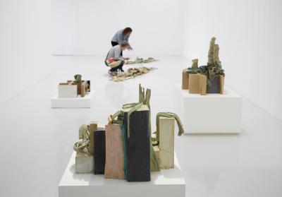
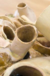
Utopian architectural models, housing structures made by animals, buildings made of organic materials: once the chain of associations has begun, Isa Melsheimer’s new ceramic works invoke a host of possible identifications, scales, stories, and purposes. We see them as buildings despite the fact that these sculptures have only a few features that clearly designate them as such. They oscillate between fragment and model, between made and grown, between artificial and natural, frozen under a glaze that reminds us of efflorescences, oxidized rock, lichen, or sedimentary strata. Crystalline forms and lamellar parts meet unarguably architectural elements, while openings on the sides allow a view into the inner life of their construction reminiscent of structural engineering. Some of the monumental ceramics are almost waist-high; others are stretched out horizontally. In their arrangement in small groups, they suggest different types of housing developments in urban and rural spaces.

At first glance, the ceramic works fit seamlessly into the artist’s long-term exploration of our built environment, the conditions of its development and the changes in how it is judged. In this environment, cultural tastes, the zeitgeist of society, technological feasibility, visions of urban planning, economic arguments, and political will are manifested. Although a building is ostensibly associated with consistency and permanence, it undergoes a continual change after it is completed – not only in regard to its material qualities and outer appearance, but also concerning its aesthetic assessment. Nonetheless, an aesthetic judgement is often still decisive in the decision-making process for a building and overrides other arguments, like functionality or practicability. This is the background for Melsheimer’s new ceramics, which for the first time do not reflect concrete buildings or architectural styles, unlike her sculptures based on buildings designed by the architects Werner Kallmorgen, Ulrich Müther, and Heinz Islar or those in her work series Communication with the Rotten Past. Instead, they are based on her investigation of animal architecture, building structures made by animals. These are, for the most part, not built according to aesthetic criteria, but must fulfill other functions. They are also remodeled and adapted when needed and thus reflect a topical issue in the current architectural discourse surrounding sustainability in which, under the theme of repair, adaptations, additions, alterations, or repairs take the place of new buildings. Possible marks of time also have their place here and can be made productive as embedded elements that provide new incentives. When understood as a continual process of improvement, architecture no longer adheres to the idea of a fixed solution and instead opens itself up to becoming an architectural act that potentially is never finished.

Just as future demands on a building are unforeseeable, so are the actors who will someday react to it through adaptations and hence become co-creators. In their hybrid appearance located somewhere between model-like experimental arrangements of human dwellings and housing structures made by other creatures – or between human-made, animal-made, and grown – the ceramics suggest that this architectural process is located in a world that is no longer anthropogenic. Rather, the artist seems to be thinking about Donna Haraway’s age of the Chthulucene in which all possible species and creatures can exist and act collaboratively. Architecture in the Chthulucene would not be completed in terms of time or form and, as a sediment, would be a genuinely sculptural process, because it is additive. By incorporating non-human organisms, it would unveil previously unknown aesthetics, materials, and ideas of what constitutes a work. Isa Melsheimer’s ceramics hint at where this journey could take us.
Text: Verena Gamper

The Outshined City

11.09.2022 to 29.10.2022
Galerie Jocelyn Wolff, Paris

CONCRETE BODIES ARE FINITE

27.03.2022 to 26.06.2022
Centre international d'art et du paysage Île de Vassivière

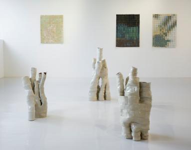
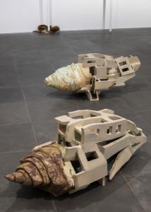
In a new series of large-scale ceramic works, Melsheimer draws inspiration from the plant Welwitschia mirabilis, which grows in the Namib desert of Namibia and Angola. Named after the first European to describe the plant in 1859, Welwitschia is inscribed within a legacy of 18th and 19th century European expeditions in which plant specimens were collected, taxonomized and added to botanical collections. In the case of Welwitschia, a double claiming thus occurred–of the plant itself and the right to name it.
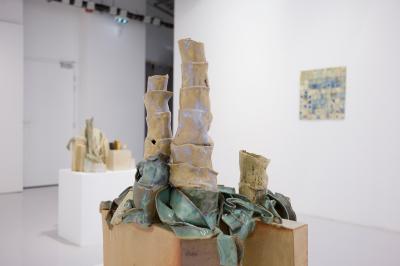
Melsheimer’s pieces depict Welwitschia-like forms that gradually merge with architectural elements. With their tentacular leaves interweaving and gradually engulfing the built forms, the plants appear to merge with the architecture, perhaps enacting their own organizational principles and right to claim.
 The combined sculptural gesture of Melsheimer’s pieces, which gain in height as horizontal leaves intertwine with vertical walls, evokes another series of works with their own legacy of extraction and contested ownership: the Parthenon Marbles, now in the collection of the British Museum. Through this formal gesture Melsheimer makes oblique reference to the historic act of colonial acquisition and entitlement, as well as ongoing disputes over restitution.
 For the artist, this historical act of appropriation finds an echo in postmodernism, where stylistic or theoretical citations from the past are decontextualized and juxtaposed in new form; a renewal of appropriation as plunder.
 Melsheimer’s Metabolit sculptures (2019-20) are glazed ceramic forms that also combine organic and architectural elements. Leaf-like shoots are barely contained by their boxy surroundings. Bulbous concretions erupt from planar facades and cubic volumes, their mottled surfaces glistening and foaming as if still in motion. The result is a series of works in mutation: uncontainable, undisciplined forms exceeding imposed constraints.
 Other works in the exhibition tackle hubristic architectural and technological projects through the 20th and 21st centuries, positing that the grand narratives of modernism persist, and that ideologies and styles are rejected only to be revived anew.
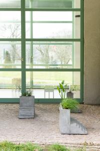
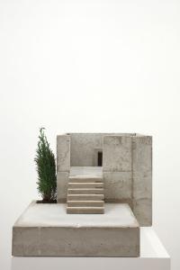
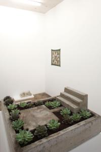
 While some works seem to condemn our collective actions, especially in terms of our destructive relationship to the planet, other pieces display a more playful attitude. Small-scale ceramics and a series of stepped concrete forms bring the epic gestures and overarching narratives of modernism down to earth. Utopian architectural masterplans are reduced to ornamental planters and decorative household objects.
The ensemble of works in the exhibition suggests a reckoning with the legacies of modernism, as well as a recalibration of human relationships with the environment. Plants and other non-human species are shown to have their own potential for agency. Some works may be read as incursions of natural elements into manmade forms, or even menacing reactions to humans’ destructive ways. Conversely, these evolving states of engagement between organic and inorganic, between plant and manmade, are perhaps proposals for alternative forms of interaction: not antagonistic but rather hybrid or symbiotic. Melsheimer’s works suggest a type of multispecies kinship as defined by feminist theorist Donna Haraway: a making-with other entities, rather than self-making, in order to build more liveable futures together.
Text: Alexandra McIntosh

COMPOST

20.11.2021 to 08.05.2022
MAMAC | Musée d'Art Moderne et d'Art Contemporain

Since 30 years, her work has questioned modern architecture as much as our natural environment. She most often works in situ. Her practice spans painting, embroidery, sculpture and integrates natural and vegetal world. Her work questions the complex and evolving relationship between humans and their environment.
Architecture plays a central role in Isa Melsheimer's work, particularly the forms and leading figures of modernism, notably Ludwig Mies van der Rohe and Le Corbusier, evoked in the exhibition through the paintings he created in 1938-39 on the walls of Eileen Grey's Villa E-1027 in Roquebrune-Cap-Martin.
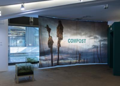
For her exhibition at MAMAC, the artist delved into the rich history of the Côte d'Azur, a territory of experimentation in modern architecture which today leaves a legacy of villas, sometimes unsuspected, nestled in the heart of the hills and palm trees. This intertwined destiny of adventurous patrons, opened to the innovations of their time, and innovative architects, intersects with the imagination of an eternal Riviera and its desirable landscapes. The palm tree, although introduced during the 19th century (massive plantations of tropical species date back to the 1860s), at the time of the development of international winter tourism, appears today as an indigenous plant and a symbol of the French Riviera.
The artist proposes a hybridization of this dreamed and fantasized Riviera and the transformation of the shoreline due to the infestation of palm trees by the red weevil.
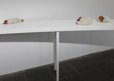
The gallery is transformed into an oniric and metamorphical landscape in which ceramics of the worms of the insect and evocations of modernist architecture intertwine, creating the perhaps fertile ground for a story to come.
Text: Hélène Guenin

false ruins and lost innocence

06.12.2020 to 20.03.2021
Esther Schipper, Berlin

Der unerfreuliche Zustand der Textur

22.03.2020 to 05.07.2020
KINDL – Zentrum für zeitgenössische Kunst, Berlin

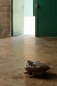
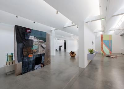
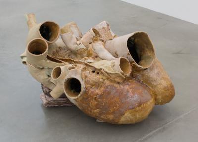
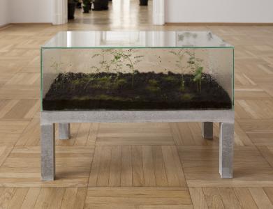
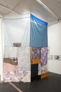
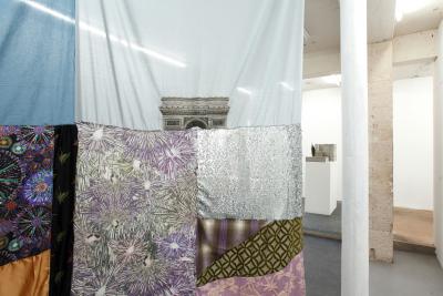
In her solo exhibition Der unerfreuliche Zustand der Textur (Predicament of Texture) in the Maschinenhaus M2 at the KINDL – Centre for Contemporary Art, the artist Isa Melsheimer is presenting various series of works from recent years, including concrete sculptures, ceramics, textile works, gouaches, ensembles with living plants, as well as her only video work to date, Wasserballett für Marl (2017). Melsheimer’s oeuvre revolves around architectural and urban topics. One focus is modernist and postmodernist architecture and their underlying conceptions of human beings and nature, built space, and society. She finds inspiration for her work in literature, film, popular culture, and academic texts, including the book Staying with the Trouble by the American science theorist and feminist Donna J. Haraway, who foresees the need for new relationships and interferences between humans, machines, animals, and plants for life on the destroyed earth in the Chthulucene era. In interaction with the architecture of the Maschinenhaus M2, the placement of three ceramic whale hearts begins a narrative that connects individual series of works in the exhibition space through specific aspects. Walherz, Walherz (Jordan), and Walherz (Squish) (all 2018) resulted from the artist’s impressions during a fellowship on the island of Fogo in Newfoundland. Here she observed whales and conducted research on the life of marine mammals. This led her to the sensational journey of a 300-kilogram blue whale heart, which was transported from Newfoundland to Brandenburg to be plastinated in 2015 before returning to Canada. Melsheimer engaged in depth with the history of the island, the ecological and economic consequences of overfishing, the effects of global warming, and the icebergs that pass by in the spring, which are marketed as a tourist attraction. This resulted in works such as the gouache Nr. 437 (2017), in which the luxurious Fogo Island Inn is attacked by an enormous octopus, and the embroidered Curtain (Year of the Whale) (2018), which captures the artist’s view from her studio and at the same time points to the landscape, including indigenous plants and animals such as the humpback whale and cod—both of which are now nearly extinct in the region. The work Wardscher Kasten (Fogo Island) (2018) is based on the mobile greenhouses developed by Nathanial Bagshaw Ward in 1830—ideal containers for transporting plants from distant colonies to imperial England. The moisture that condenses on the glass walls of the hermetically sealed systems allows the plants to grow without additional inputs. For her miniature biotopes Isa Melsheimer uses
seeds that she collected on Fogo Island or—for the new version Wardscher Kasten (Palermo) (2020)—in the Botanical Garden of Palermo. In the spirit of Haraway’s “new relationships,” works such as Peene Valley (2019) and Afterlife (2019) meld cubic ceramic architectures with plant or animal shapes. Melsheimer thus takes up the architecttural utopias of Japanese Metabolism—a movement in the late 1950s and 1960s that called for the fusion of architecture and biological material and designed functionally composed living modules based on living things such as fungi, plants, and cells. The model-house-like sculptures made of concrete and ceramic which are grouped together like a cityscape in the exhibition space question and comment on urban living spaces and their cultural codes in a specific way. The two concrete floors from Frei Otto / westliches Haus (2012) are based on the floor plan of the well-known eco-house in the Tiergarten district of Berlin whose individual cubeshaped modules were designed according to their residents’ needs. 0-House I and 0-House II (both 2012) take up the idea of the Japanese Zero Yen Houses: highly functional miniature dwellings such as boxes, consisting of collected materials, inspired by the makeshift huts of (formerly) homeless people. In her video work Wasserballett für Marl (2017), the artist places Brutalism, which has long been widely perceived in a negative light, in a new, poetic context. The prosperity of the city of Marl in the northern Ruhr area led to the construction of a modernist town hall in the Brutalist style in the 1960s. In the pool in front of the building, which the artist had cleaned and filled, she staged a water ballet
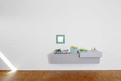
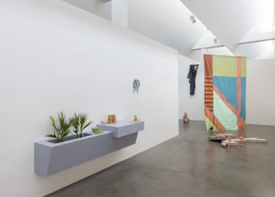
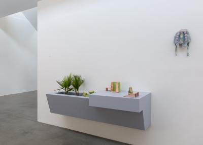
with six dancers in unisex swimwear and masks that she made specifically for the performance. The exhibition also presents a nuanced engagement with postmodernism. The title Der unerfreuliche Zustand der Textur (Predicament of Texture) is a reference to a chapter title from Collage City (1978), a critical work by Colin Rowes and Fred Koetters on modernist urban planning and its approach of “total design.” In her installation Tea and Coffee Piazza d’Italia in Post-Katrina Times (2013), the artist distances herself from postmodernism and points to its failure in the teapots and sugar bowls of the Tea and Coffee Piazza project by Alessi. In the form of a wall sculpture that serves as a furnishing for the presentation of small ceramics and two fan palms, Melsheimer’s new installation oT (2020) transports this thematic complex from public space to the interior. Isa Melsheimer’s gaze is always directed at the present: in the exhibition she brings together various discourses from different periods in order to link them from today’s perspective, question them, and thus make the change within our society visible.
The exhibition is curated by Kathrin Becker.

Metabolic Rift

17.10.2019 to 18.12.2019
Galerie Jocelyn Wolff

According to the Marxist definition taken up by John Bellamy Foster, the Metabolic Rift is "the irreparable rift in the interdependent process of social metabolism" (K. Marx, Das Kapital) or the disconnection of the metabolic interaction between humanity and the rest of nature derived from capitalist production and the growing division between the city and the countryside. Isa Melsheimer adopts this concept - recently used in the debate on the new geological era, the Anthropocene, defined by the influence of the human on the environment - to project it on at least two other cultural horizons.
The first is Metabolism, an architectural movement developed in Japan after the Second World War, whose mentor is Kenzo Tange and whose pivotal moment is 1970 Osaka World Exhibition. The futurist and utopian projects of the Japanese metabolists, engaged in the process of reconstruction of Japan from the rubble of
war, was to conceive structures that emulated the functioning of a living organism. Repeatable and multipliable modules like cells, floating ocean-cities, mushroom or bamboo-houses were conceived to give birth to a "vital" architecture and to promote the exchange, the circulation, like a breath, between artifact,
Man and Nature. Futuristic imagination also irradiates the second reference horizon of Melsheimer's show: the literature and visual culture of science fiction. I would say more precisely that this conceptual field allows the artist to stage the set where her story takes place, a set in which Karl Marx's negative parable overlaps with and materializes the utopian/dystopic projections of Japanese metabolists.
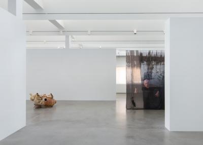
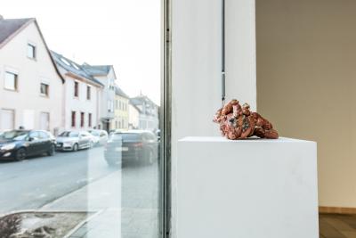
From the "metabolic rift" rain into the exhibition spaces glazed ceramic concretions: the series of Bacteria (small shapeless objects, bulbous masses of clotted matter, macroscopic visions of the cells of an organism infected by a virus) inaugurate and accompany the development of the metabolic process. Ceramics comes from clay, clay from the earth - earth and water (the artist herself personally creates the glaze compound) -: the biochemical reactions give rise to effects of synthesis (anabolism) and degradation (catabolism) while the gesture of production refers to an alchemical and almost witchcraft process suggested by the image imprinted on Vorhang (Slothrop). On the curtain (device of the cinematographic-theatrical setting par excellence), the masked artist launches an anathema from a morass. The morass where the image has been taken is called Peenetal (from the Peenetal river name) and it ends in the Peenemünde aerea known for an Army Research Center where, during the Second World War, the German Army conducted experiments on guided weapons and large-scale rockets. The tapered shape of the missiles is suggested both by the work Survival bag, a mummified cactus and shreds of fabric, and by Neon West (pieces of ceramics shaped like cactus and architectural objects in concrete).The environment setting designed by the curtain is dark, perhaps toxic, the one where the Argala Marabou lives (a bird, sewn on the second wing of the curtain, of the family of the stork but who lives in the garbage he eats). The mask (Facekini), as monstrous as the characters of Resident Evil: afterlife, flanks sculptures of miniature buildings with wide open jaws that show rows of bloody teeth (Afterlife) as well as cubic structures invaded by a fluorescent vegetation whose colors seem to change if only you take your eyes away, melted like ice in the sun or under the effect of the infection that pervades the stage space (Peene Valley). Through the "metabolic rift" the vision of the world is dark, of that colour which the bitterness, but sometimes also the irony, has. For those who love science fiction and popular culture it will be ironic to find in the title of Vorhang (Slothrop) the name of the protagonist, Tyrone Slothorp, of Gravity's Rainbow by Thomas Pynchon, a spy-story about sex and weapons that takes place during the Second World War against a dramaturgical tragicomic background. The title of the sculpture Neon West, on the other hand, brings the reflection back to the work of the 'marxist-environmentalist' Mike Davis, Casino Zombies : True Stories form the Neon West. Walking through this microcosm of coloured monads, total units or minimal parts of an evolving whole, the visitor will then be able to reflect on questions that Karl Marx, the metabolists and the authors of sciencefiction have posed in the past on the idea of a future that eminently questions our contemporaneity: sustainability, the survival of Humankind with the environment in its relationship with industry and culture or its disappearance in a process of collapse and dehumanization similar to the destiny of Tyrone Slothorp.
Text: Martina Panelli

Metaboliten

22.12.2018 to 20.01.2019
Kunstverein Heppenheim

Psychotropische Landschaften

14.04.2018 to 10.06.2018
Städtische Galerie Delmenhorst

Psychotropic Landscapes, Annet Reckert
Ballardian Intro
Hooked by the eponymous promise of the psychotropic, those visiting the exhibition muster up hope for measures that might expand their consciousness. A thoroughly useful attitude in view of art per se and, at that, for a special trip proposed by Isa Melsheimer with her show for the St.dtische Galerie Delmenhorst. It first takes us to Vermilion Sands, to the setting of a literary creation by James Graham Ballard (1930–2009).  With its extravagant coastal villages, the C.te d’Azur may have been the source of inspiration for the British science-fiction author, perhaps even the cities and deserts in the American West or paintings by Hieronymus Bosch and Yves Tanguy. His short story The Thousand Dreams of Stellavista from 1962 is set in Stellavista, a village that lethargically plods along. There where the residual heat of former decadence glistens over the overgrown estate, protagonists Howard and Fay Talbot move into PT house no. 99. It is a psychotropic house whose outer appearance in the shape of a giant orchid tells of its former owner. Unlike a static house, a PT house can turn its inner life outward.  Set in motion at the touch of a button, the incessant deformations and discolorations of its plastex walls reflect the mental state of its residents.  It feels, it reacts, it remembers. Individual and house transgress their subject-object spheres; it is “like inhabiting someone else’s brain.”. Howard eventually experiences how the history of the neurotic home is ominously connected with his existence. He barely escapes the stifling convulsions of the house, which now looks “like a surrealist nightmare, all the perspectives slipped, angles displaced ”. In an introductory cabinet to her exhibition, Isa Melsheimer illustrates this and other stories by J. G. Ballard with an installation that includes selected pieces of pottery, gouaches, and in particular sequencesof photographs found on the Internet or taken herself. As an enthusiastic cineaste and appreciator of architectural history, she arrangesvisual associations that feature desert landscapes, postmodern buildings, as well as celebrities from the art scene and show business. Legendary figures like Alfred Hitchcock, Grace Kelly, Andy Warhol, Yoko Ono, DennisHopper, or Siegfried and Roy appear, between them mundane swimming pools that sparkle in turquoise blue, obscure figures, corpses, and often tremendously fascinating mushroom clouds. Beauty and disaster establish a beguiling liaison, and all of it melts to become a setting for the delicately colored ceramic sculptures, which as model organic-tectonic-style buildings would have undoubtedly been popular with Howard and Fay. J. G.  Ballard’s animated structures inspired the sculptural process. Moreover, the titles of the works suggest that they are also an homage to the legendary Maisons Bulles (bubble houses) designed by the Hungarian Antti Lovag, as well as to the cell and shell houses by Pascal Häusermann and the organic buildings by Jacques Gillet.
Bacteria
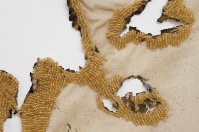
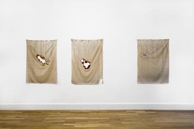
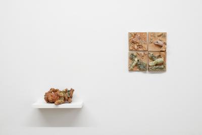
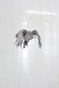
Vacillating between the apocalyptic blues and a futuristic fever, Isa Melsheimer sends her public into different zones in which times from eons ago and visions of a future world merge. With her sculptural macro Bacteria, 2017, along with its accompanying four-part tile ensemble she buffs up the grimy image of those microorganisms with which terrestrial life began around 3.5 billion years ago. Here, bacteria are the quintessence of becoming and passing away. They already existed unimaginably long before humanity, and they will continue to exist long after it has perished.  The chromaticity of the enchanting sculpture Bacteria is unsettling, as is the gloss of its all-too-human skin tones with their shimmering bluish-green nuances, which recall our veins. The imaginary ceramic invention, which is touchingly reminiscent of a naked animal baby, calls to mind the fragility of the structure of our world. This is accompanied by the delicate cloth works in the space. Created in 2012, they are singed, shabby curtains that Isa Melsheimer embroidered. With a snow owl on the wing camouflaged by the paleness of the ground, with beadwork edging that creates the impression as if the large burn holes in the cloths are now treated wounds. Looked at from a mapping bird’s-eye view, they become invigorated forms, turning into animals, islands, continents.
Heart Chamber
In fall 2017 Isa Melsheimer was able to pursue her artistic research as an artist-in-residence on Fogo Island off the coast of Newfoundland.  From her studio she saw whales passing by, while her research into the marine mammals in the Internet led to the discovery of horrifying images: a single mouse click took her to countless photographs of beached whales that had died in agony and whose bloated bodies were about to burst. In 2015 and with a huge media contingent, the 300-kilogram heart of a blue whale that had beached itself on the coast of Newfoundland traveled to Brandenburg in order to in turn be plastinated there for a Canadian museum.  In 2018 this gruesome journey inspired the creation of a heart sculpture threesome—two smaller pieces of pottery and an extremely weighty, large work. The small heart sculptures hold their own as sassy, rosy creatures; one of them is set upright like a nude, positively obscenely posing beauty.  The large heart, whose chromaticity alternates between raw earth tones, shiny caramel, and something leathery, propels the exhibition in any direction imaginable. A gaze fired by one’s imagination that slides over the monstrosity follows the rises, layers, chasms, and trenches of a landscape.  Viewed from a different perspective, one believes to be looking at an amorphous creature with lappets and wrinkles, with swelling forms, lewdly sprouting tubes, crust, and severed tentacles. And those on the move speleologically explore the visible ducts, caves, and propped up vault of the natural structure, while multidisciplinary thinkers see a fantastic pump motor—and are from now on driven through the spaces by its throbbing and droning.
Machines That Connect the Earth with the Sky
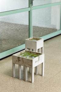
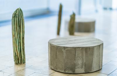
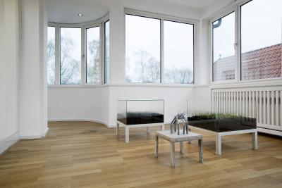
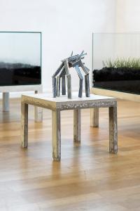
If the Städtische Galerie Delmenhorst, Haus Coburg, were a psychotropic house, it would pulse with rapture despite the ensemble presented in the winter garden. The long-legged Pimoa Cthulhu from 2017, whose title makes reference to the species of spider of the same name and, tellingly, to the long-since classic horror and fantasy world of H. P. Lovecraft joins company with two in-vitro sculptures made of concrete, glass, soil, and vegetation. Wardscher Kasten, Fogo Island (The Wardian Case, Fogo Island) from 2018 is a hermetically sealed system in which seeds that the artist collected on Fogo Island, and which cannot be more closely identified, are left to their own devices. The Brit Nathaniel Ward invented such cases in the eighteen-thirties, making plants transportable even over long journeys by sea and thus lending wings to the hunt for plants in the service of the colonial powers. Isa Melsheimer’s greenhouse sculptures are miniature experimental biotopes, each of which contains a specific location. As minimalist monuments they remind us that as the first completely terrestrial entities it was plants that created the atmosphere.  In his fundamental criticism of our zoocentric worldview, Emanuele Coccia writes: “By the same token, photosynthesis is a big atmospheric laboratory for the transformation of solar energy into living matter.”.  Vegetation, every plant, is a “machine that connects the earth with the sky.”⁴ In Isa Melsheimer’s postmodern sculptures, after a long time it is mostly ferns or the horsetail that begin to grow. In Haus Coburg’s winter garden she devotes a work of her own to the latter, a living fossil whose hollow stalks, stiffened by knots, inspired French architect Jacques Cou.lle’s curved concrete roofs made using ceramic tubes (Fus.es C.ramiques) in the forties.
Dangerous Beauties
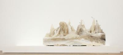
The burgeoning glass mountains in Melsheimer’s psychotropes develop their very own charm with the changing incident daylight.  The shrunken beauties wickedly and pleasantly glisten from a dark olive green and brown to the turquoise and glacial colors of their sharp-edged peaks—and yet they are very profanely a metamorphosis of commercially available wine bottles. Each mountain seems like a whipped up fluid that has solidified into crystal, and when visitors meander around them like drones with their gaze lowered, then they are reminiscent of the fantasy palaces from Michael Ende’s The Neverending Story, from the classic The Wizard of Oz, or tracking shots over monstrous urban nightmares in numerous science fiction movies. If one’s gaze glides over the glistening wonderland, it comes upon a number of gouaches that the artist combines with inkjet prints, with her own photographs of the unstable, bubbling terra of Iceland. Postmodern buildings such as the city hall in the Israeli city of Bat Yam, built between 1961 and 1963 by architects Alfred Neumann, Zvi Hecker, and Eldar Sharon, or the well-known Binoculars Building by Frank O. Gehry in Venice, California (1991–2001), into which a sculpture by Claes Oldenburg and Coosje van Bruggen is integrated, blend into her hot-cold environments in an unsettlingly harmonious way.
Changing Room
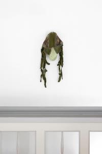
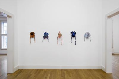
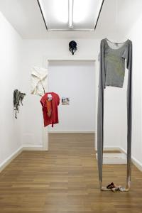
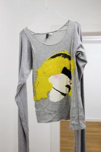
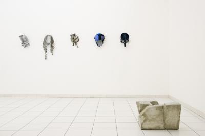
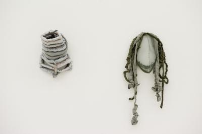
Isa Melsheimer mentally equips her fellow travelers for the last leg through her psychotropic realm in an unconventional changing room fitted with works made of fabric, including masks from the Insecta, 2014, and Trekking Masks, 2015, series. Christoph from 2009, gone over with stitching, seems downright obsessive; Gold Coast, 2010, combines meticulous embroidery with ripped fabric; Blondie from 2009 is a mutant whose ultra-long sleeves sink to the floor like aerial roots, where they sprout curious beaded membranes. Isa Melsheimer wore these pieces of clothing for a long time herself. They tell of love to a discarded skin, of wistfulness, and of the potential of any transformation. Because in terms of formal language the works allude to insects and reptiles, they fumble for opportunities beyond the humanoid. In this sense, the yellow-brown fabric work Kawasaki from 2009, presented in a display case on the floor like an archeological find, becomes a splattered milestone that in this zone once again revs up the public.
Ruins
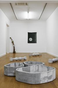
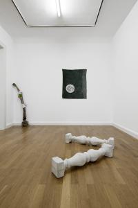
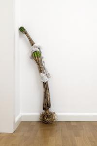
Isa Melsheimer offers trekkers the dry branch of a cactus casually placed in the corner, the last destination to home in on her Ruins, 2018.  A shabby-chic accessory with functional applications. After all, it provides a residual water reservoir and an urban utopia in the form of its immaculately washed root system that could be deployed anywhere. The sherbet colors so typical for Isa Melsheimer are faded; everything in this zone is immersed in a dystopian gray. Including the concrete sculpture Raumgruppe (Space Group) from 2013, which has just as much from anorganic chemistry as it does from Brutalist buildings from the fifties and seventies. Only those who are curious and willing to shrink into it discover a small, burgeoning pyrite crystal. After all, a detail that sparks hope. In the installation Ruins, 2018, the title otherwise delivers what it promises. The pushed over balustrade columns contribute their bit. However, even a standard postmodern home-improvement-center product can become a fantasy ferry boat: it beams one or the other back to Vermilion Sands; it leads literary adepts into the moonlit conventual complex in which Gottfried Keller’s Eugenia, disguised as a female monk, swings her iconoclasm-programmed hammer. The title of the cloth work Garten für einen glücklosen Schattten, Mond (Garden for a Hapless Shadow, Moon) from 2011 makes reference to this inspiration.
And Sarah Connor?
There are two of them in Psychotropic Landscapes.  The artist hung a poster from Bravo magazine of the pop singer Sarah Conner, who grew up in Delmenhorst, in a bay, hidden by the large-format curtain work Fabric Fighting from 2014. And she placed a photograph featuring the long-since iconic movie character Sarah Connor from James Cameron’s film Terminator II in a bay window. An able-bodied woman bursting with vigor, a pre-cyborg that has supplied gender research with a substantial amount of material. Looked at psychotropically, if the two actually met, intense frictional energies would develop that would probably cause the bay to go into massive convulsions.  Isa Melsheimer’s artistic cosmos is fueled by the suggestive potential of literary and scientific texts, by movies, and not least by observations of our urban surroundings as they transition into nature.  The artist likewise traces the development of feminist theories from the nineties to the present. In this respect, she also accompanies the cyborg as a central figure in a post-gender world; to put it in more general terms, a critical reflection on the emancipatory potential of increasingly feasible interaction between the organic and the technological.  In view of the anthropogenic destruction of our environment and the growing possibilities in the area of biotechnology, the science historian and biologist Donna J. Haraway long since proclaimed the Chthulucene.  With this concept she predicts a world in which, far from any simple binary thought, machine, individual, animal, and plant intertwine on a tentacular, sympoetic level. In narrative allusions, some of these ideas flash up in Isa Melsheimer’s cosmos, yet they are not a condition for their contemplation. As unconventional sculptural pieces, her works develop radiance even without references. Like reactants that fall out of an inconceivable mental primordial soup, precisely and spatially set they little by little populate the floor of her psychotropes, where they splendidly flourish in aesthetic self-pleasure in front of the viewers eyes.

1.   J. G. Ballard, “The Thousand Dreams of Stellavista” (1962), Great Science Fiction (Fall 1967), pp. 64–84, esp. p. 69
2.   Ibid., p. 82.
3.   Translated from Emanuele Coccia, Die Wurzeln der Welt, trans. Elsbeth Ranke (Munich, 2018), p. 55.
4.   Ibid.
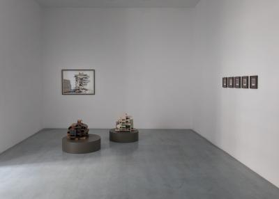
The Year of the Whale

09.04.2018 to 17.06.2018
Fogo Island Arts


The Year of the Whale
March 9–June 17, 2018 
 
Fogo Island Arts 
210 Main Street, Joe Batt’s Arm 
Fogo Island Newfoundland and Labrador A0G 2X0
Canada 
 
 
Exhibition opening: Friday, March 9, 6–8pm
 
The Fogo Island Gallery presents a solo exhibition of works by Isa Melsheimer. The Year of the Whale features gouaches on paper and a hand-embroidered curtain made during her residency with Fogo Island Arts in Fall 2017. The works seek to trouble the complex, ever-evolving relationship of humans to the environment, suggesting a rebalancing of power structures and permeable boundaries between species.
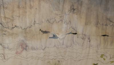
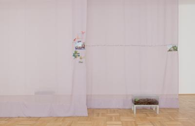
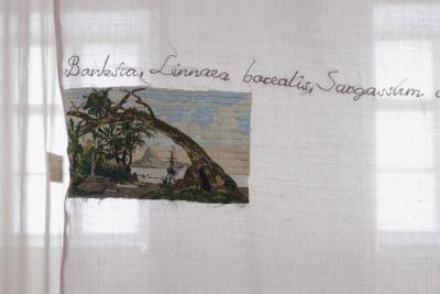
Curtain (The Year of the Whale) (2018) is a seven-metre fabric curtain that captures the view from Melsheimer’s studio. Landscape elements are alluded to rather than depicted precisely: the outline of distant hills is barely sketched in, while a single wave crests over a rocky outcrop. Indigenous plants are rendered with the exactitude of botanical specimens. A codfish and a humpback whale appear, their presence heralded not as creatures observed but to underline their historical relevance to Fogo Island and its entanglement with the sea.
Melsheimer’s landscape evokes traditional Eastern perspective, creating a vertical sense of distance with areas left open to the imagination. The multiview-point imagery creates an embodied sense of space that is an accumulation of time and experience, conveying a feeling of the ocean and landscape, as well as the passage of time. The curtain eschews not only Western one-point perspective, but its implication of a rational, domineering gaze over the landscape.
Four gouaches depict iconic buildings encroached by rising tides and massive sea creatures. Set against dramatic darkened skies, these are human structures amidst an environment that is at once threatening and enthralling: enveloped in the tentacles of a giant octopus or confronted by a massive iceberg. Two gouaches portray a half-human, half-animal figure, the artist herself, perhaps, merging with local fauna.
Melsheimer’s depictions reflect larger concerns of the Anthropocene, the current geological epoch in which human activity has been the dominant influence on the environment. Reading Donna Haraway while in residence, Melsheimer’s works are informed by the scholar’s conception of the Chthulucene, an alternative to the Anthropocene, which Haraway critiques for continuing to privilege humans as the main actors of our age. The Chthulucene comprises “multispecies stories and practices,” contingent relationships in constant evolution. As Haraway writes, “we are at stake with each other.” Fittingly, the rich greens and browns of the rocks in the Fogo Island gouaches portray lichen, a complex life form that is itself a symbiotic partnership between two organisms.
Melsheimer’s works in the exhibition evoke ideas of embodied experience and interspecies dialogue, foregrounding unpredictable encounters and networked, “tentacular” thinking.
 
Curated by Alexandra McIntosh (Director of Programs and Exhibitions, FIA) and Nicolaus Schafhausen (Director, Kunsthalle Wien and Strategic Director, FIA).
 
 
About Fogo Island Arts
Fogo Island Arts is a residency-based contemporary art venue for artists, filmmakers, writers, musicians, curators, designers, and thinkers from around the world. Since 2008, FIA has brought some of the most exciting emerging and renowned artists of today to Fogo Island, Newfoundland, to take part in residencies and to present solo exhibitions at the Fogo Island Gallery. FIA also presents programs in cities across Canada and abroad, including the Fogo Island Dialogues interdisciplinary conversation series, as part of its international outreach. FIA is an initiative of Shorefast, a registered Canadian charity with the mission to build economic and cultural resilience on Fogo Island.


Rain

07.02.2018 to 13.01.2019
Le 19 Crac, Montbéliard

Über die Dünnhäutigkeit von Schwellen

12.03.2016 to 16.04.2016
Esther Schipper, Berlin

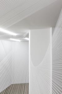
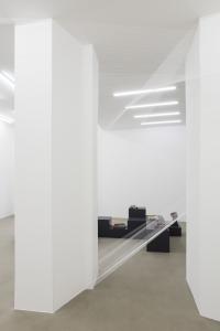
Esther Schipper is pleased to present Isa Melsheimer’s second solo exhibition with the gallery. Entitled Über die Dünnhäutigkeit von Schwellen, the exhibition includes new concrete and ceramic works. In addition to a suite of gouaches, the rooms will be altered by a network of threads addressing the changeability and fragility of space, both in general and in the context of the specific conditions of this exhibition space.
Known for her engagement with the history of architectural styles—especially the legacy of Modernism and of concrete constructions from the 1960s and 1970s, a style generally referred to as Brutalism—Isa Melsheimer’s works are expressions of her intense research as well as formal investigations. The artist acts as archeologist of often forgotten or neglected buildings, recreating their distinctive shapes both from her study and from her vivid re-imagining of the forms and the spirit of the structures. Even if the individual buildings are not all well known and therefore might not be immediately recognized, the formal language is familiar
and has become a ubiquitous part of the urban landscape. Her work seeks to examine the connotations of the building’s historical and architectural context, and the ideological connotations with which its materials, aesthetics, and functions may be imbued.
The concrete works in this exhibition take as points of reference Brutalist buildings that were neither popular nor critical successes and have subsequently been demolished.
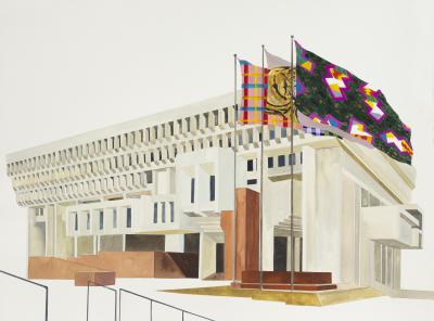
In her gouaches of architectural sites Isa Melsheimer constructs small autonomous worlds, seemingly detached from their real- world settings. The artist often choses black and white source material showing the building in their original condition, that is, without signs of subsequent decay or dilapidation and without later architectural or landscaping additions. Isa Melsheimer effectively reimagines the colors of the buildings and their interiors, unrestrained by the strictures of verisimilitude. The impression of these structures existing in a self-contained, timeless space is further emphasized by the fantastic elements that appear in these environments: wild animals like foxes or porcupines, clusters of brilliantly colored crystalline formations and/or extravagantly dark starry night skies.
Isa Melsheimer’s glazed ceramics  and another kind of representation of architectural structures that depart in scale, material and color from their sources. Although their scale recalls the miniaturized and schematic appearance of preliminary architectural models, the material and colors add a fantastic, playful aspect, and even let the works appear akin to individual personages.
A large-scale installation using threads to create geometric shapes addressing the architectural conditions of the exhibition space will span both rooms. In 2015 Isa Melsheimer installed a similarly expansive network of threads at the Espace Culturel Louis Vuitton in Paris.
Both Isa Melsheimer’s object-based works and her gouaches take a certain amount of free license, sometimes containing elements of fantastic recreation, but are always infused with a deep understanding for their architectural sources.

We live in townscape and, after a trek, we shop in Futurism

17.09.2015 to 14.11.2015
art3, Valence

Die Architekturtheoretiker Colin Rowe und Fred Koetter sagen in „Collage City“,
dass der Kult der Townscape und des Science-Fiction, also die Stadt der Zukunft, mit Megabauten, Wegwerfgütern, plug-in Städten, Bewegungssytemen in Röhren, eine unbewusste Wiederbelebung des Futurismus ist und an denselben Defekten leidet.
Und dass die Utopie von Superstudio die Befreiung von der Tyrannei des Objekts und 
Disney World die symbolisch amerikanische Utopie nach Themen gestaltete, in einer gewissen Weise sehr ähnlich sind. 
So werden alle Utopien zu Dystopien, und mir bleibt, den Ausstellungsraum als Stadt der Zukunft alla Superstudio zu sehen, und den Boden, die Bühne, das Plateau zu öffnen, um dann Obdachmachen, Zuhausesein, Marathonlaufen oder Architektur zu spielen.
 

Kontrastbedürfnis

12.07.2015 to 04.10.2015
Ernst Barlach Haus, Hamburg

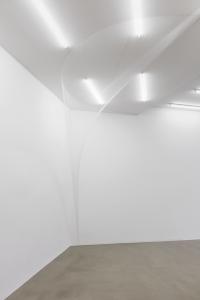
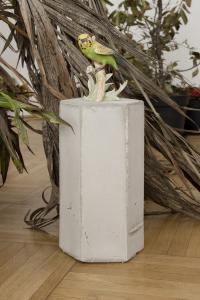
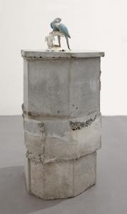
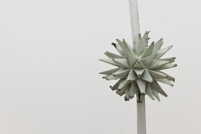
A filigree crystal beneath a shimmering aureola – the Berlin-based artist Isa Melsheimer (*1968) has given her exhibition Need for Contrast, at the Enrst Barlach Haus in Hamburg, a remarkably delicate, poetic opening. The thread-work Circle / Star, which enters the space like a column of light from a round opening in the ceiling, and the sculpture Luckhardt 3, an assemblage of small glass plates, create an atmosphere of weightlessness. In its spaceship-like outline, Luckhardt 3 goes back to a theatre designed by the architect Wassili Luckhardt in 1921; Isa Melsheimer created the object in 2009 as a response to the architectural utopias of the artistic correspondence known as the Crystal Chain. Now this sparkling starship announces a journey into the future. Ready for take-off. Isa Melsheimer explores urban living spaces and the prerequisites for their design and change. She is equally interested in the formal vocabulary of modern architecture, urban-planning scenarios and the dynamics of social tension. Often responding to the specific sites of her exhibitions, Melsheimer creates complex spatial installations with surprising leaps in scale, changes of perspective and material contrasts – Post-modern Ruin applies her strategy of pointed polarisation in a combination of fine porcelain parakeets and a crude concrete pedestal. Along with sculptures in glass, concrete or ceramic, her model-like setups also include embroidered curtains or networks of thread, arrangements of collected objects or ensembles of living plants. The sculptural work is accompanied by gouaches in which quotations from art, architecture, design and pop culture overlap and interfuse. The imaginative variety and wide intellectual range that Isa Melsheimer can open up in real spaces is shown in her exhibition Need for Contrast, whose title quotes the architect of the Ernst Barlach Haus, Werner Kallmorgen (1902–1979). In his “need for contrast”, Kallmorgen saw a basis for the design, observation and experience of buildings, and Melsheimer, who has borrowed the term for her exhibition, feels it to be a basic motivation of her artistic work. Her installations set up collision courses which lightly disturb and energise things, shifting and readjusting our point of view – and suddenly illuminating the fact that even firmly established circumstances are ultimately created by ourselves and can thus be altered. Isa Melsheimer takes Kallmorgen’s plea for contrast as the starting point for artistic excursions into the architectural and urban culture of Hamburg. Apart from the Ernst Barlach Haus, which opened in 1962, she wittily trains her sights on more of Kallmorgen’s striking buildings, sounding out their functional architecture and sometimes dysfunctional history. Melsheimer’s exhibition tour covers two spaces: the atrium and the large exhibition hall on its north side. While the latter space, with its skylight niches and stone landings, is an originally preserved creation of Werner Kallmorgen, the atrium was fundamentally altered in 1995/96: the formerly open-air courtyard substantially forfeited its original character through the addition of a glass roof and a light stone floor. In the juxtaposition of her two exhibition spaces (between which a facade of windows enables visual relationships and interplay) Melsheimer addresses the issue of different temporal horizons: buildings are redesigned and turn out, in their transformation, to be indicators of changes in human needs and social values. In Hamburg eloquent proof of such changes is provided by some of Werner Kallmorgen’s buildings, which Isa Melsheimer arranges in the atrium in the form of concrete models: his Kaispeicher A, built between 1963 and 1966, and the ensemble of the Spiegel and IBM Towers, constructed from 1966 to 1969. Melsheimer followed the history of these buildings with great interest, and has them appear several times in a sequence of 27 small-format photographic prints. While the imposing Kaispeicher A has been transformed into the pedestal for a new prestigious landmark, and now – gutted and refilled – serves as the foundation for Herzog & de Meuron’s Elbphilharmonie, the Spiegel ensemble, after the news magazine moved to the HafenCity and following several years of ruinous vacancy is currently being converted into the apartment hotel Hamburg Heights (“Arrive at the top!”) for solvent business people a remarkable change in function for the former headquarters of critical leftwing journalism. Kallmorgen’s post-war classics as current points of political crystalisation and urban friction, as objects of social transformation: Isa Melsheimer has a marked talent for searching out controversial phenomena and illuminating connections, and then weaving them into a tightly linked artistic network. Here she begins in the courtyard of the Ernst Barlach Haus, which thanks to its glass roof frequently provides an opportunity to experience the Hamburg summer in an unfamiliarly Caribbean mode. Melsheimer uses this potential to style the atrium as an exotic tropical greenhouse in which Kallmorgen’s large buildings face an entropic future. The evocatively luxuriant and alarmingly austere staging of concrete skeletons and remnants of glass, through which the visitor wanders like Gulliver in Lilliput, encapsulates the motto Isa Melsheimer has chosen to supplement her borrowed exhibition title: “Back to the future – elimination of error.” Pile of Snow gives an absurd accent to the surreal atmosphere of this overheated apocalyptic scenario. The object in glazed ceramic that Melsheimer has placed at the heart of the Spiegel ensemble is in no way indebted to an inclination towards artistic distortion, but on the contrary to particular faithfulness to sources: in one of the most famous photographs of the Spiegel compound, which Melsheimer studied closely for her research, a pile of snow becomes a secret protagonist; ist amorphous form asserts itself in the strictly gridded setting, and attenuates the apodictic sharpness of this photographic homage to the right angle. Isa Melsheimer considers Kallmorgen to be a pioneering builder in his precise, functional formal language, and she is impressed by his architectural selfconception. In his reserved, indeed servient attitude to his commissions he almost seems to come from another planet in today’s era of spectacular ego-architecture. Melsheimer’s appreciation of Kallmorgen becomes apparent in the exhibition. For example, she has chosen to use the original furniture he designed for the Ernst Barlach Haus as the basis and diving board for her artistic journeys through time. Along with four showcases she uses a large square table which – as shown by a historical photograph from the opening year of 1962 – enthroned a massive glass ashtray. Melsheimer takes this object as the starting point for imaginary journeys into the past – symbolising as it does an astonishingly permissive (at least in the matter of smoking) society that now, a few decades later, already seems to be eons away. This society is recalled by other images in the photographic sequence: round-table political debates, for example with Helmut Schmidt, can be seen alongside a smoking Audrey Hepburn in “Breakfast at Tiffany’s” not to mention a portrait of the smoker Ernst Barlach Isa Melsheimer has integrated two of Barlach’s early ceramic vessels – “Nöck” and “Merman”, from 1903/04 into the exhibition; they correspond to her own three ashtray variations on Kallmorgen’s table, to which she was inspired by Barlach’s art-nouveau works, but also by the facade of the Spiegel Tower and the undulating roof of the Elbphilharmonie. The clever marketing strategies currently being used to advertise the luxury flats in the Elbphilharmonie are presented in a table showcase Modern Times. Here a glossy magazine is held open by a flesh-coloured object like a fork or dowsing rod. Its anthropomorphic form is taken from the concert hall’s futuristic window panes, which reappear in numerous advertising images. Alongside this insight into a sleek, elegantly hypothermic future world (for which a little army of troublemaking origami animals has struck out), the February 1969 cover of the “Spiegel” magazine points to urban-planning conflicts in its title story, “Spoiling the future. Housing in Germany”. In the same issue the publisher announces ist move into the recently completed Spiegel Tower. On the back page there is an advertisement for the cigarette brand Ernte 23, produced by the Reemtsma company. Its director for many years, Hermann F. Reemtsma, first met Ernst Barlach in 1934, and in 1961 commissioned Werner Kallmorgen to build a museum for the artist’s work in the Jenischpark. A chain of associations comes full circle. The fantastical excursions in which Isa Melsheimer interleaves apparently disparate phenomena as seamlessly as she thread-morphs heterogeneous forms into one another are journeys into the past and future. Accordingly, the Kallmorgen cosmos is consistently linked to the parallel universes of science, both academic and popular, the comic and the science-fiction film. All kinds of time-travel theories and stories, symbols and metaphors from these worlds have been brought into the exhibition. Melsheimer quotes the butterfly effect, for example – which describes the incalculable effects of the most insignificant causes in chaos theory and thus plays a central role in the genre of the time-travel film – first as an embroidered visualisation of a system of differential equations, formulated by the meteorologist Edward N. Lorenz in the early 1960s, on the curtain Lorenz Attractor, and second as an elaborate butterfly-shaped network of threads which concentrates into radiation beams, escapes from the showcase Future Prospect  and transforms itself into a star on the wall. On other curtains, which also allude to the museum’s original décor of light drapes around the inner courtyard, Isa Melsheimer names the physical paradoxes associated with time travel, or configures beaded wormholes, whose contractions of space and time could perhaps make time travel possible. The installation naturally also features curious time machines from various films – the Cosmic Key from “Master of the Universe”, the DeLorean DMC-12 sports car from “Back to the Future” and the whirlpool from “Hot Tub”. Together with a comic version of H. G. Wells’s science-fiction classic “The Time Machine” (1895), Isa Melsheimer gives the cheap plastic merchandise a classy showing in Kallmorgen’s tall purist cabinet. Stills from all these films are interspersed in the above-mentioned photographic sequence, which is introduced by five gouaches paraphrasing early Kallmorgen buildings from 1929 to 1931: the Renner Summerhouse in Sierksdorf on the Baltic Sea, the Nordwald House in Hamburg-Osdorf and a residential and commercial building with an illuminated advertising facade of frosted glass. Isa Melsheimer, however, takes the buildings out of their historical contexts and carries them off into mysteriously glowing cosmic spaces. Yet again Need for Contrast enables new connections to be made through looking and thinking. Ready for take-off.
Karsten Müller

Examination of the Origins

28.02.2015 to 28.04.2015
Quartz Studio, Turin

Examination of the Origins
Francesca Referza
 
 
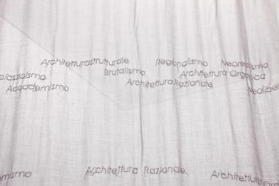
Melsheimer explains: "The idea behind the title is my interest in some of Turin's housing. My interest focuses on twentieth-century Italian architecture, the coexistence of Rationalism, the Novecento and the Roman School during Fascism. I am also interested in their continuation to the 1960s, joining with new influences, such as Frank Lloyd Wright's Organic Architecture from the United States. Another inspiration in developing the project was Quartz's space, especially its floor and its hexagonal tiles." 
 
Twentieth-century Italian architecture is a springboard for Melsheimer's personal reflection, starting from several buildings that were key parts of architectural design in Turin and Milan in the 1950s and 1960s. She particularly focused on several famed buildings, such as the Velasca Tower by Studio BBPR in Milan, which preserves an aesthetic sense of the medieval city; the INA-Case Falchera housing district; the Bottega d'Erasmo by Gabetti and Isola, which brings back the tradition from the early 20th century in Turin and was termed neo-Liberty style; the Palazzo del Lavoro by Pier Luigi Nervi, a spectacular example of the architect's "structuralism;" and the innovative Palazzo delle Mostre (PalaVela), designed by the engineer Franco Levi and architects Annibale and Giorgio Rigotti. Then there are two lesser-known buildings by Enzo Venturelli, which are fascinating for their originality: the home/studio of the sculptor Umberto Mastroianni and the aquarium-reptile house in the zoo, for which Venturelli coined the terms Architecture for the nuclear age or Atomic architecture. The architecture accomplishments achieved in Turin in the mid-20th century are a natural outgrowth of its cultural vibrancy, bolstered by its industrial development and figures the likes of Lionello Venturi, Edoardo Persico and Riccardo Gualino. After World War II, Turin was much more about opening to Europe, compared to Rome, buried in its classicism or Milan, which had become an expression of 20th-century architects' "return to order." Italian Neorealism, most firmly established in literature and film, also made its influence felt in architecture, fostering a return to "roots" based on drawing from local traditions and construction techniques, which moved away from Rationalism. 
 
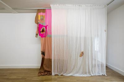
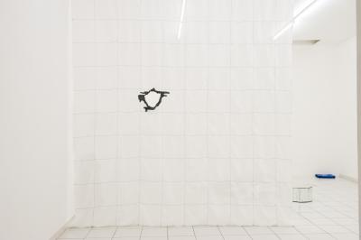
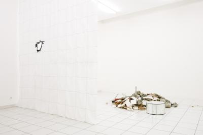
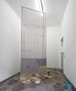
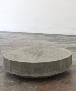
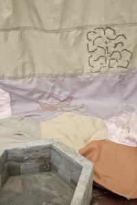
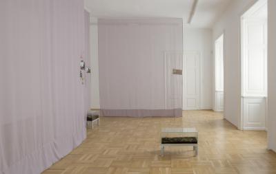
As Melsheimer noted, in Italy, more than anywhere else, the attempt to go beyond the modern movement took off in a multiplicity of directions with different inspirations, often with contrasting results, and was not always warmly welcomed by contemporary critics. The artist stitches the narrative of this special period in Turin architecture into images on the fabric of a curtain hanging from the ceiling to the floor and covering part of the cement tile floor. Several cement and ceramic sculptures are placed on the curtain on the ground, popping up all about like in a winter garden. These simple, minimalist structures are designed based on the hexagonal shape of the cement tiles, a common feature in Italy on floors between the late 19th and early 20th centuries. Melsheimer has long been interested in architecture and landscape as a whole. Here she again turns the tangible quality and power of built forms into a delicate, unstable installation, with minimalist embroidered designs and small sculptural forms closely connected to one another. The curtain drops from above down to the floor, softening the right-angled opposition between the vertical wall and horizontal floor. This makes for a unique installation that imperceptibly transforms the space. The artist starts from the geometry of the cement tiles on the floor and conceptually opens Quartz's walls as she extends her gaze to Turin's urban and architectural history with its many extraordinary buildings—many of which have fallen into disuse or been inexplicably forgotten. 
 

Synapsen

09.12.2014 to 15.02.2015
ikob – Museum für Zeitgenössische Kunst, Eupen Belgien

The artist relentlessly explores the question of the limit by creating and moving rooms. Her series of “curtains” create, within the ikob, a multitude of synaptic contact zones, of open and changeable spaces that are crossed by numerous signals transmitting information on each side of their surface. Like membranes on which the picture is fixed, close and distant, spatial and installation-like, these curtains oscillate between transparency and opacity, opening and closing spaces, literally unveiling what the surface has to say about the depths.
As it puts into dialogue the series of curtain-veils, Synapsen offers a visual reflexion on the sensitive experience of the threshold and, simultaneously, about the close and the distant, the veil and the aura as defined by Walter Benjamin in The Work of Art in the Age of Mechanical Reproduction.

Times are hard but Postmodern

18.01.2014 to 01.03.2014
Galerie Jocelyn Wolff, paris

Times are hard but Postmodern
von Anna-Catharina Gebbers
 
Isa Melsheimer lässt mit sparsamen Setzungen ihre Arbeiten mit den Räumen der Galerie Jocelyn Wolff zur titelgebenden Installation Times are hard, but Postmodern zusammenfließen. Die behutsamen, fast spielerischen Dialoge, die Isa Melsheimer stets mit der gegebenen architektonischen Umgebung ihrer Ausstellungen entspinnt, spiegeln in dieser aktuellen installativen Anordnung das Thema der Werkgruppe: Kaum eine architektonische Epoche ist stärker durch Dialoge geprägt als die Postmoderne.
Elementare Formen wie Kegel, Kugeln, Pyramiden oder Würfel, Haut- und Sorbettöne, lamellenförmig angeordnete Oberflächen und Mustermixe: Die Form- und Farbwelt von Isa Melsheimers Werken evoziert Assoziationen zum radikalen Anti-Design der Memphis-Gruppe, die eine Abwendung vom „Internationalen Stil“ der Moderne und eine Hinwendung zum emotionalen Design der Postmoderne verkündete.
Mit einer Wandcollage zitiert Isa Melsheimer den Architekten Charles Jencks, der das symbolische Ende der modernen Architektur und den Übergang zur Postmoderne genau terminiert: Um 15.32 Uhr am 15. Juli 1972 wurde die Sprengung des Pruitt-Igoe-Wohnkomplexes ausgelöst. 1955 war in St. Louis/Missouri dieses euphorisch als zukunftsweisend gefeierte Projekt des Sozialen Wohnungsbaus fertiggestellt worden, bei dem der Architekt Minoru Yamasaki den rationalen Planungsprinzipien von Le Corbusiers moderner Wohnmaschine gefolgt war. Doch die Mustersiedlung versank nach kurzer Zeit in Gewalt und Vandalismus – und gilt bis heute als Symbol des Scheiterns moderner Architektur und Stadtplanung. Auf den Modernismus folgte die Ära einer als postmodern bezeichneten Architektur, die mit der totalitären Idee des einen universalen, rationalen, funktionalen Gestaltungsprinzips bricht und sich über ein stilistisch eklektizistisches Reagieren den jeweiligen lokalen Traditionen und spezifischen räumlichen Gegebenheiten öffnet.
Isa Melsheimer lässt die mit dieser urbanen und architektonischen Entwicklung verbundenen Hoffnungen in ihren Arbeiten spürbar werden. Das Zentrum ihres Interesses bilden Architekturen aus Rom: einer Stadt, die historisch gewachsen ist. Im Gegensatz etwa zu Le Corbusiers großen stadtplanerischen Visionen für Paris, die auf einen Flächenabriss des historischen Zentrums unter Beibehaltung einiger weniger Monumente und den Ersatz durch regelmäßig angeordnete Hochhausbauten zielte, entspricht Rom städtebaulich dem, was der Architekt Colin Rowe als „Collage City“ bezeichnete: einem unablässigem Prozess der Fragmentation, der Kollision und Kontamination mit den disparaten Ideen verschiedener Generationen.
Doch wenn Isa Melsheimer sich in diesem Sinne auf ideelle Stadtplanungen von Architektengruppen wie UFO, Superstudio und ihre Megastruktur-Persiflage The Continous Monument oder Archizoom Associati und deren Modell der No-stop City bezieht, blitzt darin auch die Reflexion eines hinter manchen postmodernen Entwürfen trotz aller Modernekritik liegenden technikverherrlichenden Denkens auf.
Auf einem an die Grafiken von George Hardie erinnerndem Stoffobjekt inszeniert Isa Melsheimer in sinnlich-zarter Stickerei und doch provokant zwei prominente römische Bauten: die 12 v. Chr. als Grabmal fertiggestellte Cestius-Pyramide und den 1943 für Mussolinis Stadplanungsprojekt EUR fertiggestellten Palazzo della Civiltà Italiana. Beide Gebäude sind weder im römischen Stadtraum nebeneinander lokalisiert, noch sind sie im architekturhistorischen Sinne postmoderne Bauten. Dennoch stehen sie hier wie selbstverständlich nebeneinander und untermauern so die Collage-City-These von Rom als einer in ihrer nonlinearen Entwicklung funktionierenden Stadt.
Isa Melsheimers Werke erinnern zudem daran, dass die Postmoderne mit ihrer Reemotionalisierung der jahrzehntelang auf Funktionalisierung reduzierten Architektur idealistisch begann und mit Alessi-Korkenziehern und Zuckerdöschen endete:
Noch 1974 verbrannte der Designer Allesandro Mendini in einer ritualhaften Performance seine Lassù-Stuhlobjekte. 1979 initiierte Mendini mitten in der Aufbruchstimmung der Postmoderne gemeinsam mit Alberto Alessi für dessen Küchenartikelfirma das Tea & Coffee Piazza-Projekt, das Haushaltswaren als Mikroarchitekur erscheinen ließ. Zahlreiche internationale Architekten entwickelten dafür in der Art eines architektonischen Manifests jeweils Tee- und Kaffeesets.
Darunter auch Charles Jencks, der mit seinem Set die Formensprache antiker Säulen durchdeklinierte. Isa Melsheimer verbindet seine Entwürfe in ihrem Betonobjekt Tea & Coffee, Piazza d‘Italia in Post-Katerina Times mit der Piazza d‘Italia, die New Orleans 1978 für seine italienisch-stämmige Bevölkerung nach einen Entwurf des Architekten Charles Willard Moore realisierte. Einst als der postmoderne Platz schlechthin entstanden wird die Anlage mittlerweile von den immer näher heranwachsenden Hochhausarchitekturen der Umgebung erdrückt und als urbaner Treffpunkt der Bevölkerung entfremdet. Neue stadtplanerische Fragen stellen sich nach dem Wirbelsturm Katerina.
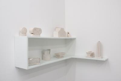
Das Spiel der Zitate weitet Isa Melsheimer in zwei als Regale angeordneten Collagen aus:  Vasen-Objekte aus Keramik zitieren die an Architekturmodelle oder Kapitelle angelehnte Yantra Vases (1969) von Ettore Sottsass und erinnern an Rem Koolhaas‘ Manifest Delirious New York (1978). In drei in Tiffany-Technik hergestellten Objekten klingen die Miniaturen des Möbelherstellers Vitra an: Sottsass‘ Regal Carlton, ein Dachaufbau, aber auch ein in Italien populärer sternförmiger Lampenschirm.
Mit Wandmalereien geht Isa Melsheimer auf die spezifische Lokalität und Geschichte des Galerieraumes ein, indem sie Linien verlängert und Punkte verbindet. Auch dies ist ein Flirt mit dem postmodernen Spiel der Zitate, des Ornamentalen und des Entlanggleitens an Oberflächen. Isa Melsheimers Gouachen collagieren grafische Entwürfe mit Gebäuden aus Boston, Berlin, London und Rom - ein Fuchs verweist auf Isaiah Berlins Modell vom unzusammenhängenden Denken gegenüber dem zusammenhängenden, auf ein universales Gestaltungsprinzip gerichtetes Denken des Igels.
Das italienische Sprichwort „Die Zeiten sind hart, aber modern“ wurde ebenfalls vom deutschen Philosophen Peter Sloterdijk in seiner Kritik der zynischen Vernunft (1983) aufgegriffen: Sloterdijk legt dar, wie der einstige Kynismus als eine Antithese zur griechischen Akademie und Ventil einer entmachteten Bevölkerung in einem neuzeitlichen industriellen oder postindustriellen System zu einem Zynismus von nur mehr merkantil verstandenen Handlungen gerinnt.
Humorvoll weckt Isa Melsheimer Skepsis daran, ob die Postmoderne oder andere Formen von radikalem Individualismus trotz allen hoffnungsvoll idealistischen Anfängen tatsächlich einen radikalen Bruch mit der Vergangenheit darstellen oder doch nur Aspekte des technologisch rationalen, nüchternen und funktional effizienten Modernismus und damit eine besondere Erscheinungsform des Kapitalismus verkörpern. Isa Melsheimers Werke regen dazu an, die Spielräume zu untersuchen, in denen sich Widerstand entfalten könnte.

Plant Hunters

20.03.2013 to 27.04.2013
Galerie nächst St. Stephan Rosemarie Schwarzwälder

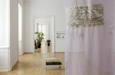
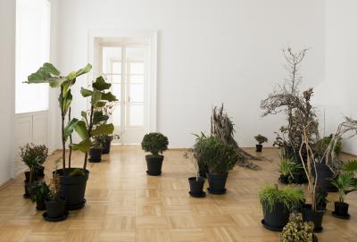
Isa Melsheimer konnotiert ihre Installationen, skulpturalen und textilen Arbeiten und Gouachen mit architektonischen Bezügen, mit Fragen zur Behausung und Gestaltung der unmittelbaren Umgebung und greift auch städtebauliche Aspekte auf. Sie abstrahiert dabei einzelne formale Komponenten, um deren kulturelle Codes zu befragen. In letzter Zeit schuf sie Skulpturen, die Beton und Vegetation in Beziehung setzen. In ihrer dritten Einzelausstellung in der Galerie nächst St. Stephan Rosemarie Schwarzwälder wagt sie nun einen expliziten Exkurs in die Pflanzenwelt, im speziellen in botanische Gärten. Sie untersucht dabei deren Idee und Geschichte und die mit ihnen verbundenen prekären Implikationen von Eroberungszügen und Kolonialismus. Der Pflanzenjäger, etwa seit dem 17. Jhd. tätig und im 19. Jhd. zum respektierten Berufsstand erhoben, war Naturkundler und Forschungsreisender, der die Weltumsegler im Dienst der Kolonialmächte begleitete. Was er an Bäumen, Zier- und Nutzpflanzen und Gewürzen ausgrub und was je die Mutterländer erreichte, gelangte in die botanischen Gärten der europäischen Metropolen, so die Beute unter den neuen klimatischen Bedingungen erfolgreich kultiviert werden konnte. Botanische Gärten wurden dieserart zum Spiegel der jeweiligen Nation und ihres kolonialen Machtbereichs. Der Pflanzentransport aus Amerika, Asien, Australien und Afrika auf dem Seeweg war aufwendig und verlustreich, von den gesammelten Pflanzen kamen nur wenige lebend an. Unwetter, Salzwasser und die mangelnde Pflege durch die Matrosen ließen oft nur eine Pflanze von tausend überleben. Pflanzen waren kostbar und wurden als „grünes Gold“ gehandelt. Die Tulpenmanie löste eine der ersten gut dokumentierten Spekulationsblasen der Wirtschaftsgeschichte aus. Die Erfindung des englischen Arztes Nathaniel Ward brachte ab 1835 eine entscheidende Wende für den Transport des wertvollen Guts. In luftdicht verschlossenen, mit feuchter Erde gefüllten Glasgefäßen konnten Samen und Keimlinge den wochenlangen Transfer auf dem Seeweg überleben. Im ersten Raum der Ausstellung nimmt Isa Melsheimer mit ihren Skulpturen die Idee der „Wardschen Kästen“ auf, als Pflanzenjägerin lässt sie in Glaskuben verschiedene Pflanzen aus dem botanischen Garten von Lissabon, eine Welwitschia mirabilis aus der „Namibia“-Abteilung des botanischen Gartens in Berlin-Dahlem und eine Maria-Theresia-Palme aus Schönbrunn gedeihen. Als Raumteiler fungieren bestickte Tücher mit Motiven wie etwa einem Grabrelief der altägyptischen Königin Hatschepsut, das ihre Rückkehr aus dem eroberten Land Punt darstellt - zu Schiff samt Pflanzentransport. Oder etwa die Meuterei auf der Bounty, die möglicherweise auch deshalb ausbrach, weil die Matrosen zugunsten von Brotfruchtbäumen auf Trinkwasser verzichten mussten. In ihren Gouachen wiederum verbindet Isa Melsheimer Pflanzenstudien mit Architekturelementen. Der anschließende Raum zeigt die Folge der „Wardschen Wende“, die das „grüne Gold“ im Zuge globalisierter Kapitalisierung zu traurigem Dasein in Spar-, Aldi-, IKEA- und anderen Märkten verdammte. Überzüchtete Palmen, Orchideen und andere einst teure exotische Gewächse verdorren im Massenangebot zum Sonderpreis. Dazwischen sind Wellensittiche aufgestellt, die kleinen, billigen Abkömmlinge der wertvollen Papageien aus herrschaftlichen Volieren, nun massenhaft im Angebot für den kleinbürgerlichen Haushalt. Als teure Porzellanfiguren erheben sie Einspruch und erinnern an kostbares Vitrinen-Inventar. Die Fenster der Galerie sind mit milchiger Flüssigkeit bestrichen, es herrscht Treibhausatmosphäre. Isa Melsheimers Ausstellung ist ein in sich geschlossenes Biotop, kein Blick dringt nach draußen.

A GREEN ARCHIPELAGO

02.06.2012 to 28.07.2012
Esther Schipper, Berlin

 
Berlin – A Green Archipelago
Isa Melsheimer’s Take on an Urban Concept 
 
Von Anh-Linh Ngo
 
 
Die Konjunkturphasen von Planungskonzepten verlaufen für gewöhnlich antizyklisch zur ökonomischen Entwicklung. Denn gerade in Krisenzeiten laufen Architekten und Planer zur Hochform auf. Offenbar sind sie die einzig verbliebene Spezies, die daran glaubt, dass ein Plan die Welt wenn nicht retten so doch zum Besseren wenden könne. Ein besonderes Beispiel eines solchen Rettungsplans ist das viel bewunderte und immer wieder zitierte Konzept „Berlin, das grüne (Stadt)Archipel“, das Oswald Mathias Ungers, Rem Koolhaas und andere 1977 als Ergebnis der Sommer Akademie Berlin der Cornell University, an der Ungers damals lehrte, vorlegten. Die Studie schlug ein unerhörtes Modell für die vom Kalten Krieg arg gebeutelte „Frontstadt des Westens“ vor: Um der schrumpfenden Einwohnerzahl und dem Verfall der städtischen Bausubstanz durch Leerstand und ausbleibende Investitionen zu begegnen, soll die isolierte Stadt gewissermaßen in einem Akt der Autopoiesis ihre Insellage zum Ordnungsprinzip erheben. Die durch Krieg und Teilung fragmentierte Stadt soll ihre stadträumliche Realität anerkennen und zuspitzen. Ohne falsche Sentimentalität sollen nur solche Teile erhalten werden, die intakt und klar identifizierbar sind, während der Rest rückgebaut und als Grünbereiche ausgewiesen werden. Das Hauptziel besteht darin, aus der diffusen Stadtstruktur deutlich erkennbare urbane Inseln herauszuoperieren, die aufgrund ihrer Geschichte, ihrer sozialen Struktur und ihrer räumlichen Qualität „Identitätsräume“ bilden und als Leitbild für die je besondere zukünftige Entwicklung der Einheiten geeignet scheinen. Jede Einheit bildet dabei eine „Stadt in der Stadt“, wie die Verfasser das Konzept ebenfalls nennen. Die Stadt Berlin gibt es somit nicht mehr, sie besteht vielmehr aus einer „Föderation unterschiedlich strukturierter, bewusst antithetisch gestalteter Stadteinheiten“, die lediglich durch die Matrix der Grünzonen zusammengehalten bzw. getrennt werden. 
 
Die Faszination, die dieses radikale Konzept heute immer noch ausstrahlt, liegt in seiner besonderen Ambivalenz und Vielschichtigkeit: Es nimmt in seiner Dekonstruktion des Territoriums das Ende der Allmachtfantasien der Moderne vorweg, bietet aber dennoch eine ganzheitliche Vision an. Und es vereinigt gleich zwei starke Zeitströmungen in sich: den ökologischen und den postmodernen Gedanken, die Ende der Siebziger Jahre ihren unaufhaltsamen Aufstieg begannen. Ökologisch ist das Konzept, weil es mit allem bricht, was die moderne Stadtplanung bis dahin auszeichnete, nämlich mit dem Optimismus eines grenzenlosen Wachstums, das der einschneidende Bericht des Club of Rome erst wenige Jahre zuvor an sein Ende kommen sah. Insofern kann man es als das erste genuin „grüne“ Stadtkonzept ansehen, und das nicht etwa aufgrund seines aus heutiger Sicht suggestiven Titels, der metaphorisch die Grünzonen als das Meer evoziert, in dem die Stadtinseln wie ein Archipel schwimmen. Vielmehr weil es erstmals mit der kapitalistischen Wachstumsideologie bricht, die konstitutiv für die moderne Stadt ist. Denn im kapitalistischen Sinne stellt Stadt ein räumliches Organisationsprinzip für die arbeitsteilige Gesellschaft dar und ist somit der Logik der Mehrwertakkumulation, d.h. der Expansion ausgesetzt. Ungers geht es nicht mehr um die strahlende Stadt der Zukunft, sondern um den Umgang mit den Problemen der postindustriellen Stadt, die in Berlin gewissermaßen unter künstlichen Laborbedingungen frühzeitig zum Vorschein kamen.
 
Glücklicherweise argumentieren die Verfasser nicht vordergründig ökologisch, sondern zunächst rein stadtmorphologisch. Die Vielzahl historischer Bezüge und Zitate – von Karl Friedrich Schinkels Konzept einer Kulturlandschaft mit frei fluktuierenden architektonischen Katalysatoren über den Idealstadtplan von Karlsruhe bis hin zu klassischen Blockstrukturen à la Manhattan und modernen Stadtvorstellungen wie Iwan Leonidows Bandstadt für Magnitogorsk – machen „Berlin, das grüne Stadtarchipel“ zu einem postmodernen Stadtkonzept. Die gesamte Stadtplanungsgeschichte und mit ihr der immanente Architekturdiskurs werden als Resonanzraum aktiviert. Aber da die Zitate immer auch für etwas stehen, in diesem Fall für gesellschaftliche Visionen und den utopischen Überschuss, den sie in ihrer jeweiligen Zeit erzeugt haben, gewinnt der Plan eine utopisch-politische Dimension, die weit über das postmoderne Zitieren hinausweist. Man muss nicht soweit gehen und in den städtischen Einheiten ein Echo von Ungers’ historische Untersuchung der „Kommunen in der Neuen Welt“ sehen, die er gemeinsam mit seiner Frau Liselotte Ungers im selben Jahr herausbrachte, in dem, wie es der Zufall so will, der oben erwähnte Bericht des Club of Rome über „die Grenzen des Wachstums“ erschien. Es reicht, darin das Misstrauen gegenüber der einheitlichen und vereinheitlichenden Stadttheorie der Moderne zu sehen, der Ungers ein pluralistisches, in diesem Sinne wahrhaft postmodernes Stadtverständnis gegenüberstellt: als System unterschiedlicher Orte, die „miteinander eine vielfältige und komplexe städtische Umwelt bilden“.
 
Schließlich kann man im Archipelkonzept die Kulmination der Untersuchungen sehen, die Ungers während und nach seiner Zeit an der TU Berlin in den berühmten, von seinem Lehrstuhl herausgegebenen „Veröffentlichungen zur Architektur“ publizierte. Bereits in den Sechziger Jahren beschäftigt er sich mit Themen wie der Großform im Wohnungsbau, der Wiederentdeckung der Wiener Superblocks als soziale Einheiten oder mit dem Wohnen am Park, wo erstmals das Thema der architektonischen Landschaftsgestaltung am Beispiel der Bauten der Havellandschaft auftaucht. In all den Arbeiten zeichnet sich bereits das Interesse ab, die Stadt in ihren Einzelphänomenen zu verstehen und nach der Dekonstruktion neu zusammenzusetzen. Hierin manifestiert sich eine tiefsitzende Skepsis gegenüber der modernen Stadtplanung, die den Plan als eine politische Autorität, als Tatsache etabliert hat, die angeblich rein rationalen Kriterien befolgt. So suchte Le Corbusier in einer schwindelerregenden Volte in seinem Buch „La Ville Radieuse“ die ursprünglich an eine Herrscherperson geknüpfte Autorität auf den Plan selbst zu übertragen, damit fortan die Planumsetzung kraft einer internalisierten Macht des Faktischen erfolge. Mit diesem Trick konnte der Schöpfer des Plans nun selbst über die Autorität des Plans verfügen. Bereits die Situationisten durchschauten den Trick und machten sich daran, mit Dérive, Psychogeographie und anderen Methoden die funktionalistische Rationalität des Plans in Frage zu stellen und andere Lese- und Gebrauchsweisen der Stadt freizusetzen. Auch daran knüpft „Stadt in der Stadt“ implizit an.
 
Stadt als Readymade
Mit Visionen verhält es sich jedoch so, dass sie immer von der Realität überholt werden. Statt mit Schrumpfung, verfallenen Stadtteilen und fallenden Immobilienpreise haben wir es heute, 35 Jahre nach „Berlin, das grüne Stadtarchipel“ und 23 Jahre nach dem Fall der Mauer, mit einer anderen Form des Inselurbanismus zu tun. Zwar suchte Hans Stimmann, berüchtigter Berliner Senatsbaudirektor der Nachwendezeit, mit dem „Planwerk Innenstadt“ die Autorität des Plans formal wiederzubeleben, um letztlich nur zu verschleiern, dass die faktische Macht über die zeitgenössische Stadtentwicklung bereits auf andere „Autoritäten“, auf Investoren nämlich, übergegangen ist. Hinter den vereinheitlichenden Fassaden der so genannten „Berlinischen Architektur“ konnte der Ausverkauf Berlins in Ruhe vonstattengehen. Die Maskerade erwies sich dabei als äußerst nützlich für das Kapital, das sich so dem Anschein der Regelkonformität geben und im Gegenzug die besten Filetstücke der Stadt „entwickeln“ konnte. Und so geschah es, dass wir in der Sorge um ein vermeintlich im Entstehen begriffenes „Neuteutonia“ die eigentliche Gefahr, die in der neoliberalen Logik der Stadtentwicklungspolitik lag, zu spät erkannten: die pervertierte Form eines faktischen Inselurbanismus. Unter diesem Begriff lässt sich heute die Auswirkungen der Privatisierungspolitik der letzten beiden Jahrzehnte zusammenfassen, die statt Pluralität zu erzeugen, wie es das Ziel des Archipelkonzepts war, Enklaven der Exklusion und gleichzeitig eine Nivellierung der „Identitätsräume“ geschaffen hat. Statt mit Urban Villas als dem zur Konsolidierung der Inseln von Ungers und Co. bevorzugten Gebäudetyp, der in idealer Weise die Sehnsucht nach individuellem Eigenheimglück und kollektiven urbanen Lebensstil in sich vereinigte, haben wir es heute mit seinen Wiedergängern oder Bastarden zu tun, den Townhouses, Urban Villages und Gated Communities, die wie keine anderen Typologien für die fortschreitende Gentrifizierung und soziale Segregation der Stadt stehen. 
 
Es ist daher aus stadtpolitischer Sicht erhellend genau hinzuschauen, worauf Isa Melsheimer ihre Auseinandersetzung mit dem Thema fokussiert, gerade weil die Arbeit aus einer künstlerischen, intuitiven Perspektive erfolgt. Es ist bezeichnend, dass sich unter den wenigen architektonischen Fragmenten, die sie eigens für die Ausstellung  maßstäblich in Beton nachbaut, ein Modul der Häuser am Lützowplatz findet. Die von Ungers im Zuge der IBA ab 1979 errichteten Bauten waren gewissermaßen der Versuch, das Prinzip der Urban Villa auf den sozialen Wohnungsbau zu übertragen. Ungers hatte in diesem Projekt Innen- und Außenraum gleich groß und damit gleichwertig gestaltet, was Isa Melsheimer in ihrem Modell augenfällig herausarbeitet. Es ist dieses gegen alle Effizienzvorgaben arbeitende Raumkonzept, das aus heutiger Sicht überrascht und aktuell bleibt. Dass die Bauten in den letzten Jahren zum Abriss freigegeben wurden, ist daher nicht nur aus architekturhistorischer Perspektive ein Skandal. Der Abriss steht auch symptomatisch für eine verfehlte Stadtentwicklungspolitik, die sich den Gesetzen des Marktes unterwirft und durch Privatisierung städtischen Eigentums die soziale Segregation vorantreibt. 
 
Darüber hinaus erinnern Isa Melsheimers Arbeiten auch daran, dass wir, wenn wir heute von Stadt reden, es allenthalben mit Readymades, das heißt, mit physischen wie ideologischen Restbeständen zu tun haben, die wir wieder lesen lernen müssen. So schwimmen die architektonischen Fragmente, die Isa Melsheimer für die Ausstellung bewusst oder intuitiv ausgewählt hat – Ungers IBA-Bauten am Lützowplatz, Frei Ottos Baumhäuser im Tiergarten oder James Stirlings Wissenschaftszentrum am Kulturforum –, wie Inseln im Meer der zeitgenössischen Stadt, oder, ein wenig boshafter, wie Fettaugen in der Suppe der Alternativlosigkeit, die wir uns selbst eingebrockt haben. Sie gemahnen an eine Zeit, als noch um alternative Stadt- und Wohnkonzepte gerungen wurde und die Stadtentwicklungspolitik noch alle sozialen Schichten im Blick hatte. Und, im Falle des postmodernen Baus von Stirling, an eine Zeit, in der die Wissenschaft noch autonom, frei von ökonomischem Verwertungsdruck und Drittmitteldrama dem Wissenstrieb nachgehen konnte. An die Stelle von akademischen Elfenbeintürmen sind heute Exzellenzcluster getreten, auch sie ein weiterer Bastard des Archipelprinzips. 
 
So gesehen enthält Isa Melsheimers „Green Archipelago“ am Ende eine erstaunlich tröstliche Botschaft: Auch wenn Architektur die Welt weder retten noch zum Besseren erziehen kann, so erzeugt sie doch in den besten Fällen einen utopischen Überschuss, der noch im Zitat, im Fragment nachwirkt und uns bewusst macht, dass ein anderes Leben möglich, eine Alternative vorstellbar ist, und sei es nur als Möglichkeitsräume eines unerreichbaren Archipels. 


Vermilion Sands and Other Stories from the Neon West

14.04.2012 to 07.07.2012
Santa Monica Museum of Art

Dachgarten

09.09.2010 to 02.11.2010
Galerie Jocelyn Wolff, Paris

For her third solo show at Galerie Jocelyn Wolff, Isa Melsheimer is presenting a projectcentered on architect Le Corbusier (1887 – 1965) and his relationship, during the beginning of the 2Oth century, with a Parisian collector, Charles de Beistégui.In Paris during the 1920s, Charles de Beistégui, a fervent admirer of surrealism, asked Le Corbusier to build him an apartment, which would serve exclusively for parties. Unlike Charlesde Bestégui, the architect’s interest in surrealism was limited. The result: an apartment near the Champs-Elysées having no roof, a living room directly open to the sky, and furnished only by a fireplace. The walls were limited to 1.5 meters in height toparcel the view of certain places. For example, from one perspective, the walls allow only theupper half of the Arc de Triomphe to be seen, and from another perspective, only an upper section of the Eiffel Tower was visible. The walls could be displaced using an electrical remotecontrol, however the apartment itself had no electricity and, consequentially, was lit with candles. This apartment no longer exists today.Through the works in this exhibition, Isa Melsheimer searches to become aware of the odd relationship that united the two men during the duration of their project. Using very different mediums such as concrete, embroidery, and gouache, the artist strives to bring to the forefront a rather surprising result, for the apartment made by Le Corbusier is actually close toa surrealistic installation. Two concrete sculptures recreate two important points of the “roof-garden”. A wax sculpture on the floor made from burning candles night after night and sculpted by the wind refer to the space’s candlelit evenings. On a “Paris” scarf bought in a souvenir shop, Isa Melsheimer embroidered the map of Paris, an allusion to Le Corbusier and his schematic and naïve vision of the city. A step down to the lower, second exhibition space, the artist has chosen to create a more intimate atmosphere. A bird posted on a “tree” limb made from glass and perched near the wall conjures the apartment’s only “occupant”. Two large, kitsch embroideries take on details of the view of the Eiffel Tower and the Arc de Triomphe and, in this way, recreate a situation scenario within the space. Some architectural details of the apartment, such as the spiral stair, surface in a very peculiar manner in the gouaches hanging on the far wall.

Mittelland

02.09.2010 to 31.10.2010
Kunsthaus Langenthal

Freedom. A Poem. A Home.
 
By Fanni Fetzer
 
 
“Bettine, who seems to know everyone and is darting back and forth among the various groups, catches up with them, and in a mischievous frame of mind asks what they would wish for if they had three wishes and could wish for anything they liked. Günderrode laughs: I’ll tell you later. She knows of no wish she could make, her wishes are boundless.
And you, Kleist?
Kleist says: Freedom. A poem. A home.
Irreconcilable things which you want to reconcile.
Yes, he says lightly. I know.”1
 
Isa Melsheimer has set up a dense mesh of threads extending through three rooms and seeming to twist about itself. The work “Hyperboloïde III” (2010), inspired by the elegant shell buildings by Swiss engineer Heinz Isler (1926–2009), is as aesthetic as it is fleeting; the thread will only stretch from nail to nail for the duration of the exhibition. That Isa Melsheimer chose these three particular exhibition rooms for her installation is quite in keeping with the artist’s sense for buildings. Architecture’s struggle in the listed Kunsthaus building is particularly evident in these rooms. Here a piece of the panelling rises up from behind a lining wall, a cable snakes its way along a breast wall, or else cracks appear in an area of facing. There is an analogy, in Isa Melsheimer’s view, between the architecture she found at the Kunsthaus Langenthal and society’s handling of Heinz Isler’s concrete shells.
 
The general public is scarcely aware of Heinz Isler, although he is very much revered on the architecture scene and his shells are distributed densely around the Swiss Mittelland. His elegant buildings are much loved by experts in the field because of their large free spans, yet the great majority of people fail to even notice them. Isler’s concrete shells, grey, subtle and modest, fade into industrial zones and so are not often recognized as masterly achievements by a building pioneer. The fact that Heinz Isler was an engineer and not an architect further prevents his œuvre from gaining appropriate recognition outside a specific circle of experts. One exception is the motorway services stop Deitingen-Süd. It is a listed building whose survival is guaranteed by prominent architects. Isa Melsheimer sees a parallel in such anecdotes to the biography and reception of the works of Ulrich Müther (1934–2007), who caused a similar sensation in the GDR with concrete shell buildings, but is just as largely forgotten or ignored today.
 
Ulrich Müther’s buildings, not only amazing structures in his day but also astonishing achievements from today’s perspective, were a source of inspiration for Isa Melsheimer from an early date. She translated Müther’s complex curved forms into light, space-filling meshes of threads. This complicated transformation of an existing architectural form into a delicate fragile artwork is characteristic of Isa Melsheimer’s working method. The artist is interested not in the technical aspects of a building, but in its aesthetics, and she herself does not shy away from creating visually attractive works. The theme that preoccupies her is why architecture such as that of Müther and Isler is not widely recognized. 
A respectful treatment of the shell buildings, as part of the cultural heritage, is hindered because of a total misunderstanding of an architecture whose stringent minimalism and greatest possible material efficiency do not represent the spectacular. Where does this indifference, this disregard originate? 
In the exhibition “Mittelland” at the Kunsthaus Langenthal, Isa Melsheimer, who has also always been interested in the history of buildings, confronts the works of Ulrich Müther and Heinz Isler. While Isler’s motorway services stop is under protection, most of his other buildings remain ignored. And although Ulrich Müther gave the spa of Binz on the Baltic Sea island of Rügen an architectural icon with his life-guard station, Strandwache 1, many of his shell buildings are either decaying or earmarked for demolition so as to make way for a new touristic infrastructure. Isa Melsheimer refers to these kinds of complex architectural and economic links in her installation in the Kunsthaus Langenthal. On the floor of the exhibition room she reconstructs the Grosse Jasmunder Bodden, the venue in Ralswiek for the annual Störtebeker Festival, whose director has complained about the proximity of Müther’s ‘ugly’ shells to the festival site. On the embroidered cloth “Holzgitterschale/Rügen” (2010) over the glass lake we see a fes­tival stage in the form of a pirate ship; behind the fabric we can make out the outline of a shell building by Müther, “Gaststätte Inselparadies” (2010). As with her thread mesh, the artist succeeds in sensitively linking the captivating, if massive, concrete architecture with the fine medium of embroidery. 
Isa Melsheimer also integrates the cladding of a radiator between the windows, a further indicator of the clumsy handling of the architecture of the Kunsthaus Langenthal. The biscuit china vases stand for Rügen’s world-famous chalk cliffs, but they are filled to the brim with concrete, just as the once risky path across the cliffs and down to the beach has been reconstructed for tourists, i.e. for older people, complete with concrete steps and a handrail. Isa Melsheimer again questions the social reasons why the natural miracle of the chalk cliffs – appropriated by tourism – has been robbed of its naturalness, while the pioneering spirit in Müther’s concrete shells is ignored. Isa Melsheimer underscores the experimental character of Isler’s and Müther’s shells in her own small concrete models. Whereas Müther cast his shells with his own hands in the form-giving sand of the beach, Isler tried to generate the right (right because observed in nature and not calculated mathematically) form for his shells in his garden using ice and textiles. Isa Melsheimer too constructs the forms herself, pouring the concrete and waiting patiently for a week to see what the result is. Fragments, failed static attempts, are therefore as much 
a part of the work as are the finished adaptations. Whether the form holds or breaks, Isa Melsheimer succeeds in wresting a unique poetry from the building material concrete. Even for those who find its use in everyday life of little appeal, her works may well provide access to, if not engender a love of concrete.
 
Which subjects are socially admired, why is there so much bad architecture in European cities, and why are people moving from the city to the country? Which longings, aesthetic preferences and ideologies are manifest in our buildings? Isa Melsheimer has always been interested in architecture. She likes to view houses, read about architectural theory, and is generally inquisitive about how we live and why. Concealed behind these questions, which can also be answered purely formally, is an astute political awareness of the fact that architecture always stands for something – an ideology, concepts, an environment built in a form we have chosen or at least condoned. Although architecture, especially classical modern architecture and buildings dating from the 1960s, is a theme that attracts the artist, she has no wish to build herself. However she knows the feeling of falling in love with a building, a house by Le Corbusier or Mies van der Rohe. Isa Melsheimer approaches these icons of modernism by means of gouaches, objects made of glued glass and embroidered curtains. She chooses media which she herself can physically master, whereby she as a woman is not interested in embroidering, but rather in handicrafts in and for themselves. The cultural-historical significance of embroidery is so closely entwined with gender history that it seems almost impossible to view embroidery without making reference to this. Isa Melsheimer adopts embroidery purely as a craft. When embroidering, she does not refer to feminist positions in art. Her feminism emerges at most in a critical attitude towards aesthetic statements, and not in her processing of textile materials. For Isa Melsheimer, the fabric itself, unlike an empty white canvas, already has a high degree of materiality, added to that the yarn, the organic thread, and the considerable amount of time demanded by embroidery work. She seeks the slowness of the medium and, while embroidering, gains time for thought or acoustic books. She confronts the massive icons of architectural history not with equally massive artworks, but with this hand-crafted material which in itself already questions architecture. Instead of responding to large buildings with large works, she facilitates narrative and also speculation. Yet she always exposes these ascriptions. She pursues different view­points, and the minutiae of her art harbour the potential for diverging readings. The artist thus brings together the summer festival on Rügen and the criticism of Ulrich Müther’s concrete shells, or else transports the beauty of Heinz Isler’s developed views to the Kunsthaus Langenthal – and perhaps will thus succeed in enabling us to perceive his shells in our immediate surroundings in the future.
 
Isa Melsheimer nevertheless remains critical of the figures, the architects, and opposes the vanities of the heroes of architectural history to her own often narrative but never massive works. In “Battle Lines” (2010) 2 Isa Melsheimer takes up the tragic anecdote about the designer Eileen Gray, whose outstanding summer house on Cap Martin was decorated with suggestive pictures by Le Corbusier during her absence and without her permission, whereupon Eileen Gray never set foot inside the house again.3 Le Corbusier’s characteristic lines from that mural painting are embroidered in such as way that his handwriting is always clearly recognisable, but his insolent intervention in the house of his designer-friend is unmasked as being both chauvinistic and stupid. The work criticises not the artist Le Corbusier’s buildings, but his actions. This is done quite subtly, and thereby restores the house to Eileen Gray.
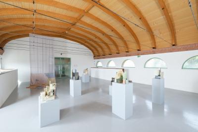
The biscuit china vases purchased by auction on the Internet (“Rügen”, 2010) or the star brought back from Rügen (“Stern/Rostock/Riga”, 2010) are found objects of a kind which Isa Melsheimer only rarely uses in her work. Yet “Stern/Taschkent” (2009) is, in the broadest sense, also an objet trouvé, discovered on an architectural trip to Uzbekistan, but too heavy to transport and therefore only brought back as an idea and copied. The origins of the object “ohne Titel (Istanbul)” 2008 are more veiled. 
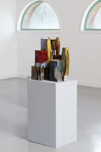
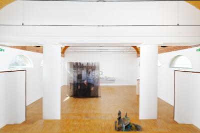
Its abstraction evokes associations with Istanbul’s multifaceted 1960s architecture, but in fact it relates to the clumsy, because self-cast, Turkish parking space obstructions. What all these works have in common is the great care with which Isa Melsheimer transforms and preserves old, forgotten and un­heeded forms and materials in her work. The artist handles the concrete shells by Müther and Isler in a similar way, albeit on a larger scale. Yet it would be wrong to assume that she only devotes herself to outsider positions and only scrutinizes small architectural irrelevancies. With the same poetic licence she also adapts Frank Lloyd Wright’s Waterfall House (“Felsen”, 2006) or Mies van der Rohe’s Barcelona Pavilion (“Sitzgruppe mit Onyxwand”, 2008) while at the same time addressing the theme of the process of aesthetic opinion-formation as the consensus of a whole generation. 
In doing so she does not express a critique of the material (onyx, in the case of the Barcelona Pavilion), but instead ­illustrates how discursive an aesthetic judgement could also be if only we would form our own opinion – for what is considered a major achievement in one context, stands for bad taste in another.4
 
The artist very subtly dismantles heroes like Le Corbusier or Sir Normal Foster. She only succeeds in doing this because these great architects already made such forceful claims with their buildings. 
“Exit” (2009), is a small piece of embroidery which Isa Melsheimer simply hung beside the service hatch of an air vent, thus quietly indicating an architectonic deficiency, a constructed inconsistency, in Sir Norman Foster’s Museum Carré d’Art in Nimes.5 Yet she does not place herself above her subject, i.e., architecture. Instead she provides us with small indications of how something could be seen differently. She does not make fun of anyone or anything, and she is not being didactic when she challenges us to look again, to look differently, to recognize the form and ultimately, to build differently. This attitude is liberating because it aims to encourage us to form and express our own opinion – even about so-called great architecture, and also in our treatment of supposedly 
insignificant everyday architecture. 
 
Isa  Melsheimer’s nimble, poetic works bring together what Heinrich von Kleist, in the opening quotation, considered irreconcilable, but very desirable – freedom, a poem, a house. She achieves this because she herself makes no massive claims, but instead subtly directs us to alternative readings, speculative stories, and prompts us to look ourselves, to form and express an opinion. Freedom. A Poem. A Home.
 
1 Christa Wolf: No place on earth, New York, 1982, ed. 2010, p. 86.
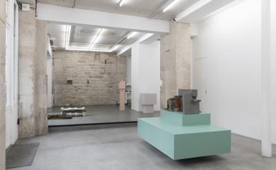
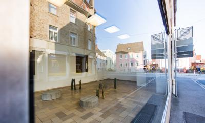
2 Isa Melsheimer’s contribution to the group exhibition 
“Living Rooms / Pieces à vivre”, Château Chamarande, France, 30.5.–3.10.2010. 
3 See Beatriz Colomina, “War on Architecture, E.1027 – House 
designed by Eileen Gray at Cap Martin, France”, in Assemblage 20, 1993, p. 28f.
4 Exhibition “Isa Melsheimer – Kunstpreis der Stadt Nordhorn 2008”, 
Städtische Galerie Nordhorn, 6.9.–19.10.2008. A central part 
of the installation was a band of onyx amphoras corresponding to 
the precise measurement of the load-bearing wall in Mies Van 
der Rohe’s famous Barcelona Pavillion. Whereas Van der Rohe’s onyx 
wall is regarded as a great moment in the history of architecture, 
the vases of the same material are like tawdry souvenirs of holidays 
in the south.
5 Exhibition “Isa Melsheimer”, Carré d’Art – Musée d’art contemporaine de Nîmes, 26.1.–18.4.2010. 
The museum designed by Sir Norman Foster is characterised by white cubes hanging in 
a load-bearing construction. But the idea of a perfect white cube 
is undermined by numerous technical details. Isa Melsheimer 
pointed to this somewhat bizarre discrepancy between aspiration 
and reality by means of different little artistic interventions.
 

Isa Melsheimer

26.01.2010 to 18.04.2010
Carré d’art, Nimes

Land aus Glas

19.02.2009 to 25.04.2009
Galerie Nächst St. Stephan, Wien

Isa Melsheimer

05.09.2008 to 19.10.2008
Städtische Galerie Nordhorn

 
1.9.2008 AND 8.11.2008
(Isa Melsheimer in conversation with Katrin Wittneven from Novem-ber 2008, as well as an extract from Wittneven’s presentation on Melsheimer’s work from September 2008)
Architecture is a central theme in your work. What are the implications with regards to planning and how do you approach exhibition spaces?
There are familiar spaces, such as gallery spaces and others, which you only know from photos. Usually, I go there first, walk around, look at maps and take in the surroundings: where is it? What kind of place is it? What is its history and how am I connected with it ? I had already exhibited at the Municipal Galerie Nordhorn in a group show three or four years ago. It was back then that this particular space, a piece of work by Steven Craig referring to Mies van der Rohe, interested me.
What did you remember?
A space within a space. I believe that Stephen Craig’s intervention had originally been much finer, purer somehow. Over the years, more and more new fixtures, offices and flooring were added so that, today, you hardly experience the space as a piece of work. I was interested in making the work visible again, extracting the ‘borrowings’ from Mies van der Rohe, explicitly the Barcelona Pavilion, and developing them further.
In Nordhorn, Isa Melsheimer came across a pavilion that had been designed as sculptural architecture by the Irish artist Stephen Craig in 1999. A versatile all-purpose space that not only in its multi-functionality, recalls the work of Ludwig Mies van der Rohe. A contemporary response to Mies’s credo “less is more”.
Looking at the basic architectural elements − pillar, wall, roof − the steel-glass-construction of Berlin’s New National Gallery (completed in 1968), as well as Mies van der Rohe’s first architectural milestone: the Barcelona Pavilion of 1929, cross one’s mind. It was with this temporary building that Mies, for the first time, began to achieve the great sense of clarity and simplicity that he strove for. The Pavilion only existed for a few months and was not re-constructed until the eighties. The crucial innovations were the “open plan” and the “flowing space”. The reinforced concrete roof of the Barcelona Pavilion rests on filigree stanchions with wall-elements and panes of glass stretching from floor to ceiling. Flooring, roof and wall-surface do not enclose the space but rather suggest peripheries. The result is a clear structure which also allows for various spatial combinations. Mies himself was well aware of the revolutionary power of this innovation: “One night, I was working late (on the Pavilion) when I made a sketch of a freestanding wall and was absolutely shocked. I knew that I had found a new principle”.
Isa Melsheimer absorbs Craig’s directions and by transforming elements of the Barcelona Pavilion into the exhibition space and translating them into her own artistic vocabulary, develops them even further. She creates a very minimalist interior: a curtain, a carpet and a pillar from chrome-plated stainless steel. The crosswise pillar − also a direct Mies quote − is rather reduced. Less is impossible, is it still meant to bear weight. It extends the raster of the exhibition’s architecture and, at the same time, in its isolation and with its minimalist reflecting surface, gains a sculptural quality. In contrast to the Barcelona Pavil-ion with its black carpet and red curtain fabric, the artist restricts herself to stone-like shades of green, brown and grey.
You take Craig’s space back to its original condition, dispense with partition walls and fixtures and, instead, combine more diverse materials: stone, glass, fabric, onyx.
I am fascinated by the story of a block of onyx which Mies came across by chance, being the starting point of a building as legendary as the Barcelona Pavilion. The dimensions of this stone were the starting point and the fixed point in the planning of the Pavilion. I’d had boards of travertine, which I had accidentally come across, sitting in my studio for some time. They seemed to be perfect for Nordhorn.
In Isa Melsheimer’s replica of the Barcelona Pavilion, the original atrium becomes a landscape of broken glass. A lucid construct, consisting of countless splinters of glass which, in its glittering, fragile beauty, appears to be vulnerable and thereby dangerous, at the same time. The plates of broken glass, shimmering in green shades, trigger associations with Caspar David Friedrich’s “Sea of Ice”, as well as with models of futuristic mega-cities. You think of a wave, frozen in its movement, but also of abstract translations of landscapes, seen on weather charts after the news. In the exhibition, they mark an area of 660cm by 100cm and thus, have exactly the dimension of the atrium of the Barcelona Pavilion. Its panes were made from white glass and so allowed the image of a secret garden to flourish.
Did you have a clear picture of the exhibition in mind, beforehand?
I clarify a lot of things with the help of a model and I usually have quite a clear idea before I start. In Nordhorn, a few things were -already predetermined, as my arrangement was based on the Barcelona Pavilion. The 120 onyx-vases were arranged on the surface of the original onyx-wall and the dimensions of the glasswork were geared to the dimensions of the atrium of the Barcelona Pavilion. 
Onyx is quite a classical material. At the same time, you caricature the traditional stone by using onyx-vases, known from tourist-traps.
This also has to be read as an ironic comment, of course. In the exhibition, you can hear extracts from an interview with Mies from 1968 over headphones. In this conversation, he explains, how, originally, the shipping company was to receive the block of onyx, in order to make large vases for the dining-hall out of it. Mies chipped off a thin slice to show how beautiful the stone was and thus, even-tually got it for the Pavilion. My work plays with the ugliness of such vases, which look rather like urns. Yet, strangely, they look quite acceptable en masse.
It was one of Mies van der Rohe’s principles to use materials as they approach you, in a way, listen to them and recognize the structural qualities of steel and stone, and in this way, to embrace them and subject them to the desired shape.
There is not much left of this liberation, of the innovations brought about by architectural modernity. Most things that are constructed today are, again, closer to the onyx-vase than to the onyx-wall. Embroidery on pillows shows examples of buildings that mainly place emphasis on their decorated facades. One example is a red brick building at Potsdamer Platz which is only a few years old and appears to be very solid but has already started to lose bricks. Only then did it become clear to me that they are not actually bricks but clinker. Strictly speaking, this means two steps back: Modernity introduced the open plan. Today, we are back at small windows in brick-walls. And they are not even real. That is simply decoration, kitsch, a tourist-trap − just like the onyx-vases.
Mies van der Rohe wanted the big hall inside the New National Gallery to be used as a stage. Isa Melsheimer’s installations and sculptures, too, repeatedly evoke associations with stages. In both, art becomes the protagonist; as does the viewer who walks around in it, picks up the thread and follows.
Is there ever a moment when you consider a space to be completed?
Yes, I think so. Often, it is very full to start with and then becomes increasingly empty. I work on details in a very precise way but I eventually get to a point where I say, okay, let’s leave it as it is. There is no such thing as the perfect space. I believe there is always more than just one possibility. Is that what you mean?
I meant it in an even more concrete way: Mies also had a theoretical background for his way of working. He once said: “I felt that it had to be possible to harmonize old and new powers within our civilization. Each of my buildings was a demonstration of this thought and a further step in the process of my own search for clarity”.
In my eyes, art can only clarify what is there already. Not only in the sense of harmony or beauty, but in the true sense of clarity. That is a good word for it.
 

Fremdenzimmer

17.04.2008 to 28.09.2008
Arp Museum Bahnhof Rolandseck

Tiefes Rauschen

02.06.2007 to 21.07.2007
Galerie Mark Müller, Zürich

Das Queens Hotel heißt jetzt Best Western

30.09.2006 to 23.12.2006
Galerie Barbara Wien, Berlin

Geliehene Landschaften

19.11.2005 to 14.01.2006
Projektraum Galerie Nächst St. Stephan, Wien

Isa Melsheimer

19.05.2005 to 25.06.2005
Galerie Jocelyn Wolff, Paris

Isa Melsheimer

18.02.2005 to 28.02.2005
The Chinati Foundation, Marfa Texas

corridors

11.07.2004 to 03.10.2004
Bonnefanten Museum, Maastricht

Raum

14.11.2003 to 31.01.2004
Galerie Barbara Wien, Berlin

Isa Melsheimer

11.05.2003 to 29.06.2003
Kunstverein Arnsberg

Isa Melsheimer

25.01.2002 to 20.04.2002
Galerie Thomas Rehbein, Köln